在 Flutter 中,布局是构建用户界面的重要组成部分。Align 和 Center 是两个常用的布局组件,它们都用于在父组件中对子组件进行对齐和居中。本篇博客将详细介绍 Align 和 Center 的用法、属性和适用场景,帮助你更好地理解和运用它们。
一、Align:精准对齐,掌握位置
Align 组件用于将子组件放置在父组件中的指定位置,并支持对齐方式的设置。Align 具有以下常用属性:
alignment(对齐方式):通过设置Alignment类的属性来指定子组件在父组件中的对齐方式。常见的对齐方式包括:Alignment.topLeft:子组件左上角与父组件左上角对齐。Alignment.topCenter:子组件顶部中心点与父组件顶部中心点对齐。Alignment.topRight:子组件右上角与父组件右上角对齐。Alignment.centerLeft:子组件左侧中心点与父组件左侧中心点对齐。Alignment.center:子组件中心点与父组件中心点对齐(默认值)。Alignment.centerRight:子组件右侧中心点与父组件右侧中心点对齐。Alignment.bottomLeft:子组件左下角与父组件左下角对齐。Alignment.bottomCenter:子组件底部中心点与父组件底部中心点对齐。Alignment.bottomRight:子组件右下角与父组件右下角对齐。
widthFactor和heightFactor(宽高因子):分别设置子组件相对于父组件宽度和高度的因子。默认情况下,宽高因子的值为 1.0,表示子组件与父组件具有相同的宽度和高度。child(子组件):要放置在父组件中的子组件。
Align 组件常用于以下场景:
-
自定义对齐:当需要将子组件精确对齐到父组件中的特定位置时,使用Align组件可以方便地指定对齐方式,实现精准的位置控制。
-
尺寸调整:通过调整
widthFactor和heightFactor属性,可以根据父组件的尺寸自动调整子组件的宽度和高度,实现灵活的尺寸调整。
下面是几个使用Align组件的示例代码,展示了不同的对齐方式和尺寸调整效果:
1.1 示例1:居中对齐
import 'package:flutter/material.dart';

void main() {
  runApp(const MyApp());
}

class MyApp extends StatelessWidget {
  const MyApp({super.key});
  @override
  Widget build(BuildContext context) {
    return MaterialApp(
      debugShowCheckedModeBanner: false,
      home: Scaffold(
        appBar: AppBar(
          title: const Text('Align布局示例 - 居中对齐'),
        ),
        body: Align(
          alignment: Alignment.center,
          child: Container(
            width: 200,
            height: 200,
            color: Colors.blue,
          ),
        ),
      ),
    );
  }
}
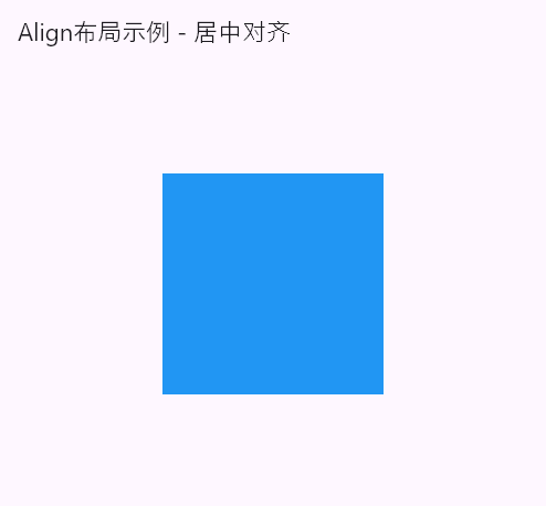
在这个例子中,我们创建了一个Align布局,将一个蓝色的正方形容器居中对齐于父组件中。
1.2 示例2:底部右对齐
import 'package:flutter/material.dart';

void main() {
  runApp(const MyApp());
}

class MyApp extends StatelessWidget {
  const MyApp({super.key});
  @override
  Widget build(BuildContext context) {
    return MaterialApp(
      debugShowCheckedModeBanner: false,
      home: Scaffold(
        appBar: AppBar(
          title: const Text('Align布局示例 - 底部右对齐'),
        ),
        body: Align(
          alignment: Alignment.bottomRight,
          child: Container(
            width: 200,
            height: 200,
            color: Colors.blue,
          ),
        ),
      ),
    );
  }
}
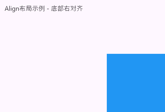
在这个例子中,我们将一个蓝色的正方形容器底部右对齐于父组件中。
emm,这些效果,看起来不够系统化。再来一些吧。
1.3 演示全部的alignment
import 'package:flutter/material.dart';

void main() {
  runApp(const MyApp());
}

class MyApp extends StatelessWidget {
  const MyApp({super.key});
  @override
  Widget build(BuildContext context) {
    return MaterialApp(
      debugShowCheckedModeBanner: false,
      home: Scaffold(
        appBar: AppBar(
          title: const Text('Align布局示例 - alignment属性'),
        ),
        body: ListView(
          padding: const EdgeInsets.all(16.0),
          children: const <Widget>[
            AlignItem(
              alignment: Alignment.topLeft,
              text: 'Alignment.topLeft',
              color: Colors.blue,
            ),
            AlignItem(
              alignment: Alignment.topCenter,
              text: 'Alignment.topCenter',
              color: Colors.red,
            ),
            AlignItem(
              alignment: Alignment.topRight,
              text: 'Alignment.topRight',
              color: Colors.green,
            ),
            AlignItem(
              alignment: Alignment.centerLeft,
              text: 'Alignment.centerLeft',
              color: Colors.yellow,
            ),
            AlignItem(
              alignment: Alignment.center,
              text: 'Alignment.center',
              color: Colors.orange,
            ),
            AlignItem(
              alignment: Alignment.centerRight,
              text: 'Alignment.centerRight',
              color: Colors.purple,
            ),
            AlignItem(
              alignment: Alignment.bottomLeft,
              text: 'Alignment.bottomLeft',
              color: Colors.teal,
            ),
            AlignItem(
              alignment: Alignment.bottomCenter,
              text: 'Alignment.bottomCenter',
              color: Colors.pink,
            ),
            AlignItem(
              alignment: Alignment.bottomRight,
              text: 'Alignment.bottomRight',
              color: Colors.brown,
            ),
          ],
        ),
      ),
    );
  }
}

class AlignItem extends StatelessWidget {
  final AlignmentGeometry alignment;
  final String text;
  final Color color;

  const AlignItem({
    Key? key,
    required this.alignment,
    required this.text,
    required this.color,
  }) : super(key: key);

  @override
  Widget build(BuildContext context) {
    return Container(
      height: 100,
      color: color,
      child: Align(
        alignment: alignment,
        child: Text(
          text,
          style: const TextStyle(fontSize: 20),
        ),
      ),
    );
  }
}
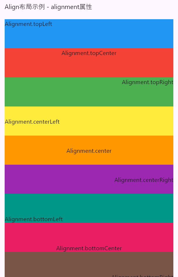
这份代码演示了Align组件的全部 9 个对齐效果,具体如下:
Alignment.topLeft: 左上对齐
Alignment.topCenter: 上中对齐Alignment.topRight: 右上对齐Alignment.centerLeft: 左中对齐Alignment.center: 居中对齐Alignment.centerRight: 右中对齐Alignment.bottomLeft: 左下对齐Alignment.bottomCenter: 下中对齐Alignment.bottomRight: 右下对齐
1.4 演示 heightFactor 和widthFactor
widthFactor和heightFactor(宽高因子):分别设置子组件相对于父组件宽度和高度的因子。默认情况下,宽高因子的值为 1.0,表示子组件与父组件具有相同的宽度和高度。
import 'package:flutter/material.dart';

void main() {
  runApp(const MyApp());
}

class MyApp extends StatelessWidget {
  const MyApp({super.key});
  @override
  Widget build(BuildContext context) {
    return MaterialApp(
      debugShowCheckedModeBanner: false,
      home: Scaffold(
        appBar: AppBar(
          title: const Text('Align布局示例 - heightFactor和widthFactor'),
        ),
        body: SingleChildScrollView(
          padding: const EdgeInsets.all(16.0),
          child: Column(
            crossAxisAlignment: CrossAxisAlignment.start,
            children: [
              const SizedBox(height: 10),
              buildAlignItem(
                color: Colors.blue,
                alignment: Alignment.topLeft,
                heightFactor: 1.0,
                widthFactor: 1.0,
                text: 'Factor.1.0 - 默认对齐',
              ),
              const SizedBox(height: 20),
              buildAlignItem(
                color: Colors.green,
                alignment: Alignment.topCenter,
                heightFactor: 0.5,
                widthFactor: 0.5,
                text: 'Factor.0.5 - heightFactor: 0.5, widthFactor: 0.5',
              ),
              const SizedBox(height: 20),
              buildAlignItem(
                color: Colors.orange,
                alignment: Alignment.topRight,
                heightFactor: 1.5,
                widthFactor: 1.5,
                text: 'Factor.1.5 - heightFactor: 1.5, widthFactor: 1.5',
              ),
              const SizedBox(height: 20),
              buildAlignItem(
                color: Colors.purple,
                alignment: Alignment.centerLeft,
                heightFactor: 0.75,
                widthFactor: 0.75,
                text: 'Factor.0.75 - heightFactor: 0.75, widthFactor: 0.75',
              ),
              const SizedBox(height: 10),
            ],
          ),
        ),
      ),
    );
  }

  /// 构建 Align 组件示例项
  Widget buildAlignItem({
    required Color color,
    required AlignmentGeometry alignment,
    required double heightFactor,
    required double widthFactor,
    required String text,
  }) {
    return Container(
      height: 200,
      decoration: BoxDecoration(
        color: Colors.white,
        border: Border.all(color: Colors.black, width: 1.0),
      ),
      child: Align(
        alignment: alignment,
        child: SizedBox(
          height: double.infinity,
          width: double.infinity,
          child: FractionallySizedBox(
            heightFactor: heightFactor,
            widthFactor: widthFactor,
            child: Container(
              color: color,
              child: Center(
                child: Padding(
                  padding: const EdgeInsets.all(8.0),
                  child: Text(
                    text,
                    style: const TextStyle(fontSize: 18, color: Colors.white),
                  ),
                ),
              ),
            ),
          ),
        ),
      ),
    );
  }
}
效果图如下所示:
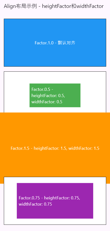
这段代码演示了使用Align组件和heightFactor、widthFactor属性来控制子组件的尺寸和对齐方式。
每个Align示例都有一个不同的对齐方式和尺寸因子,具体如下:
Alignment.topLeft- 默认对齐。子组件的高度和宽度与父容器相等,即 1.0 倍的父容器高度和宽度。Alignment.topCenter- 高度和宽度的因子为 0.5。子组件的高度和宽度是父容器高度和宽度的 0.5 倍。Alignment.topRight- 高度和宽度的因子为 1.5。子组件的高度和宽度是父容器高度和宽度的 1.5 倍。Alignment.centerLeft- 高度和宽度的因子为 0.75。子组件的高度和宽度是父容器高度和宽度的 0.75 倍。
通过修改heightFactor和widthFactor的值,可以调整子组件相对于父容器的尺寸。较小的因子值会使子组件缩小,而较大的因子值会使子组件放大。
代码中的每个示例都具有不同的背景颜色,以便更好地区分它们。
二、Center:居中之王,简单粗暴
Center 组件用于将子组件居中对齐于父组件中,无需设置对齐方式。Center 组件只有一个child属性,用于指定要居中的子组件。
Center 组件常用于以下场景:
-
居中对齐:当需要将子组件简单粗暴地居中对齐到父组件中时,使用 Center 组件可以快速实现居中布局。 -
嵌套布局:Center 组件也可以用作其他布局组件的子组件,将其包裹起来实现居中对齐的效果。
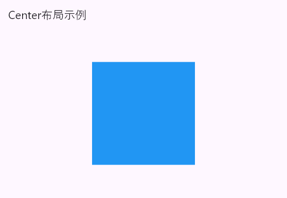
下面是一个使用 Center 组件的示例代码,展示了将一个蓝色的正方形容器居中对齐于父组件中:
import 'package:flutter/material.dart';

void main() {
  runApp(const MyApp());
}

class MyApp extends StatelessWidget {
  const MyApp({super.key});
  @override
  Widget build(BuildContext context) {
    return MaterialApp(
      debugShowCheckedModeBanner: false,
      home: Scaffold(
        appBar: AppBar(
          title: const Text('Center布局示例'),
        ),
        body: Center(
          child: Container(
            width: 200,
            height: 200,
            color: Colors.blue,
          ),
        ),
      ),
    );
  }
}
通过这个示例,你可以看到Center组件的简洁用法,将子组件居中对齐于父组件中。效果图如下所示:
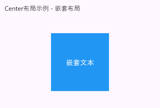
Center属性示例:嵌套布局
import 'package:flutter/material.dart';

void main() {
  runApp(const MyApp());
}

class MyApp extends StatelessWidget {
  const MyApp({super.key});
  @override
  Widget build(BuildContext context) {
    return MaterialApp(
      debugShowCheckedModeBanner: false,
      home: Scaffold(
        appBar: AppBar(
          title: const Text('Center布局示例 - 嵌套布局'),
        ),
        body: Center(
          child: Container(
            width: 200,
            height: 200,
            color: Colors.blue,
            child: const Center(
              child: Text(
                '嵌套文本',
                style: TextStyle(
                  fontSize: 24,
                  color: Colors.white,
                ),
              ),
            ),
          ),
        ),
      ),
    );
  }
}
在这个例子中,我们使用Center组件实现了嵌套布局。外部的Center组件将一个蓝色的正方形容器居中对齐于父组件中,内部的Center组件将文本居中对齐于正方形容器中。
标签:const,Center,color,Align,布局,alignment,组件,对齐,Alignment From: https://www.cnblogs.com/linuxAndMcu/p/18458618