1. Work Summary
For this project, we first browsed the paper website to select an area which we were interested in, and then we chose a essay in this area which studied the influence of certain factors on the runoff of the Min River, and then we chose a graph from this to reproduce and analyse.
In this project, we gained a better understanding of what needs should be considered in drawing and how to make the diagram better understood by the reader, such as the position of the axes, the names and units of the axes, the use of colour in drawing and so on. We also practised learning and using the libraries in python to draw dynamic diagrams.
2. Requirements
The essay is come from https://iwaponline.com/jwcc/article/doi/10.2166/wcc.2022.218/91128/Analysis-of-runoff-variation-and-driving-factors
2.1 Description
The philosopher Thales has said that water is the source of all things. On the earth where we live, there are countless rivers passing through the city, bringing the seeds of civilization and nourishing the lives of generations.
However, the rapid development of modern science and technology and the unreasonable use of water resources in the past have seriously damaged the ecological environment of river basins. In order to prevent the irreversible deterioration of the natural environment and to protect the ecological environment while making proper use of the available river resources, researchers plan to have a deeper understanding of river basin conditions and to investigate the causes of environmental degradation.
The Minjiang River is the largest tributary of the Yangtze River and the fifth largest river in China. Its geographical location is very important because its in the upper reaches of the Yangtze River, its environment is closely related to the ecological environment of the entire Yangtze River.The middle and lower reaches of the Min River are even used on a large scale for food cultivation and hydroelectric power generation, it is the water lifeline of the Yangtze River Basin. In recent years the Minjiang River Basin (MRB) has become increasingly fragile, facing many serious problems such as the possibility of decreasing annual flow (runoff) or even cutting off, water pollution and reduced biodiversity.
In order to carry out the work of maintaining the ecological environment of the Minjiang River as soon as possible, in 2022, the Key Laboratory of Ecological Regulation of Non-point Source Pollution in Lake and Reservoir Water Sources, Changjiang Water Resources Commission has published a paper that examines the changes in runoff and analyses drivers in the Minjiang River Basin over the past 60 years. The essay can provide important support for the study of hydraulic resources, ecological restoration of the Minjiang River Basin and rational planning of future river resource use. The paper can also help environmentalists to achieve environmental protection by controlling the impact factors, predicting changes in the environment through the resulting coefficients and making appropriate countermeasures in time.
We will choose a visualization in the paper to help readers understand the research surveys of ecologists on the environment, results shown in the graphs and the parameters that appear. We aims to make the graphs understandable or easier for the reader to understand the essay without reading it. And according to our article, we also call on readers to join the ranks of protecting environment and attention to environmental protection.
2.2 Explain
Explain
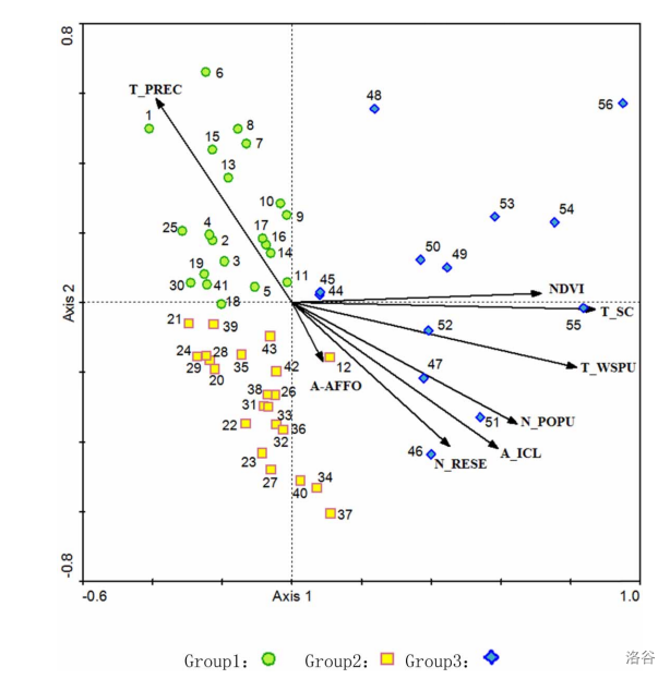
This figure represents the relationship between the runoff of hydrological stations and the main driving factors in the Minjiang River Basin. We read this figure mainly to understand the changes of the main influencing factors on river runoff over time.
About the eight driving factors:A_ICL: irrigation area; A_AFFO: afforestation area; N_POPU: population; T_WSPU: water consumption; N_RESE: number of reservoirs; NDVI: normalized difference vegetation index;T_PREC: annual precipitation; T_SC: total reservoir capacity.
On what axis1 and axis2 really stand for: by calculating the correlation coefficients between axis1, axis2 and each of the eight drivers(the eight rays in the figure), and comparing the magnitude of the correlation coefficients, T_SC, T_WSPU have the largest correlation coefficients with this axis on axis1, so the Axis1 shows how much runoff is related to human disturbance and vegetation and the Axis2 shows the highest T_PREC correlation with this axis, so the Axis2 shows how much runoff is related to precipitation. However, the correlation coefficient has no unit, so the coordinates of the two axes are not marked in the original figure and the improved figure. Therefore, when you read the map, based on the axis1 and axis2 values corresponding to the location of each hydrological station sampling point on the map, you can know the main factors affecting the runoff at that sampling point in that year.
In fact, the eight driving factors should respectively and compare each point as axis, by contrast, various points respectively driven by eight factors driving factors which influence. But in this paper, in order to facilitate rapid analysis of main influence factors, so the axis1 and axi2 respectively as with human disturbance and vegetation, precipitation of the three driving factors. So instead of comparing the points to each of the eight drivers, the reader can analyze the figure by directly referring to axis1, axis2 to see how the main three drivers affect each point.
The numbers 1–56 represent the years from 1961 to 2016. That is, the number 1 represents 1961, the number 2 represents 1962, and so on, and the number 56 represents 2016. The figure divides the 56 points into three groups based on the location of each point distribution, which side is mainly affected by axis1 and axis2, and is represented by green circle, yellow square and blue diamond.
The points mainly distributed in the upper left corner (green circle) indicate that the runoff of sampling points is mainly affected by the driving factor of precipitation, and the collection years of most points are distributed from 1961 to 1979.
Mainly distributed in the lower left corner (yellow square), the runoff of sampling points is mainly affected by three driving factors, namely precipitation, human disturbance and vegetation, and most of the points in this group were collected from 1980 to 1979.
The points on the right are mainly distributed (blue diamond), indicating that runoff at sampling points is mainly affected by anthropogenic and vegetation driving factors, and the points in this group are mainly distributed from 2004 to 2016.
Therefore, according to the annual flow direction, the main driving factors of runoff in the three groups of collection points changed from mainly affected by precipitation to respectively affected by anthropogenic factors and vegetation, and finally mainly affected by anthropogenic factors and vegetation. This shows that with the development of The Times, human activities have more and more serious impact on the runoff of the Minjiang River.
In terms of cognitive theory, this graph has some validity.
It is mentioned in cognitive theory that our attention is limited.Our brain can only process ≈1% of the visual input data. Therefore, this figure uses different color groups to stimulate readers' vision. To quickly capture the conclusion that different groups want to express.
In addition, Information visualizations should avoid total cognitive tunneling, so abnormal data is partitioned to generalize the general distribution year of the scatter points, which avoids the difficulty of information capture caused by the mixed scatter points of different colors
2.3 Figure replication
We found that the original graph was generated by a specialist ecology application (e.g. CANOCO 4.5) that would calculated the input data and plot with the results, because the method of calculating the data is unknown, we reproduced the original graph by using data extrapolated from the original graph.
import numpy as np
import pandas as pd
import matplotlib as mpl
import matplotlib.pyplot as plt
from matplotlib import patches
import matplotlib.ticker as ticker
from plotly.offline import init_notebook_mode, iplot
init_notebook_mode(connected=True)
import plotly.graph_objs as go
import plotly.io as pio
import matplotlib.ticker as ticker
corCoef = pd.DataFrame([[0.101, -0.187, 'A_AFFO'],
                        [0.458, -0.419, 'N_RESE'],
                        [0.597, -0.425, 'A_ICL'],
                        [0.655, -0.357, 'N_POPU'],
                        [0.827, -0.192, 'T_WSPU'],
                        [0.895, -0.026, 'T_SC'],
                        [0.718, 0.03, 'N_DVI'],
                        [-0.388, 0.576, 'T_PREC']],
                         index=range(1,9), columns=['corCx', 'corCy', 'arrLabel'])
Data_df = pd.read_excel('minjiangData.xlsx')
#Let code display the result as a vector image after running.
%config InlineBackend.figure_format = 'svg'
fig, ax = plt.subplots(figsize=(5,5))
#Make the displayed horizontal and vertical coordinates equal in length.
ax.set_aspect(aspect=1)
ax.set_xlim(-0.6, 1.0)
ax.set_ylim(-0.8, 0.8)
#Position and style of the x-axis main scale.
ax.xaxis.set_major_locator(ticker.FixedLocator([-0.6,-0.4,-0.2,0,0.2,0.4,0.6,0.8,1.0]))
ax.xaxis.set_major_formatter(ticker.FixedFormatter(['-0.6','','','Axis 1','','','','','1.0']))
#Position and style of the y-axis main scale.
ax.yaxis.set_major_locator(ticker.FixedLocator([-0.8,-0.6,-0.4,-0.2,0,0.2,0.4,0.6,0.8]))
ax.yaxis.set_major_formatter(ticker.FixedFormatter(['-0.8','','','','Axis 2','','','','0.8']))
#Set the border position.
ax.spines['bottom'].set_position(('data', 0))
ax.spines['left'].set_position(('data', 0))
for i in range(1,9):
    #Set arrow style.
    ax.annotate('', xy=(corCoef['corCx'][i], corCoef['corCy'][i]),
                xytext=(0, 0), arrowprops=dict(arrowstyle="-|>",color='black'))
#Define dataframe.
gOne = Data_df.loc[Data_df['categories'] == 1]
gTwo = Data_df.loc[Data_df['categories'] == 2]
gThree = Data_df.loc[Data_df['categories'] == 3]
#Plotting scatter.
ax.scatter(x=gOne['axis1'] , y=gOne['axis2'], marker = 'o',color = "#baef42",s = 15,edgecolors = '#3ba32f',linewidths=0.8,label="Group1:")
ax.scatter(x=gTwo['axis1'] , y=gTwo['axis2'], marker = 's',color = "#fcfe05",s = 10,edgecolors = '#bf7d70',linewidths=0.8,label="Group2:")
ax.scatter(x=gThree['axis1'] , y=gThree['axis2'], marker = 'D',color = "#40aac8",s = 13,edgecolors = '#151ce8',linewidths=0.8,label="Group3:")
#Set legend style.
plt.legend(bbox_to_anchor=(0.95, -0.1), loc=0, borderaxespad=1,ncol=3,
           frameon=False,markerfirst=False,labelspacing=0.5,handletextpad=0.1,
           columnspacing=1,markerscale=2,fontsize='medium',handleheight=1.5)
ax.spines['bottom'].set_position(('data',-0.8))
ax.spines['left'].set_position(('data',-0.6))
#Set the dotted line in the figure.
ax.axvline(x=0, c="black", ls="dotted", lw=1)
ax.axhline(y=0, c="black", ls="dotted", lw=1)
#Set the coordinate scale position.
ax.xaxis.get_majorticklabels()[0].set_horizontalalignment('left')
ax.xaxis.get_majorticklabels()[8].set_horizontalalignment('right')
ax.xaxis.get_majorticklabels()[3].set_horizontalalignment('center')
ax.yaxis.get_majorticklabels()[0].set_verticalalignment('bottom')
ax.yaxis.get_majorticklabels()[4].set_verticalalignment('center')
ax.yaxis.get_majorticklabels()[8].set_verticalalignment('top')
plt.yticks(rotation=90)
plt.tick_params(labelsize=7)
ax.tick_params(pad=3,colors='black',width=1,length=4,direction='inout')
plt.savefig("test.svg", dpi=1000,format="svg")
#Set scatter text description.
for i in range(len(Data_df['yearX'])):
    x1=Data_df['yearX'][i]
    x2=Data_df['yearY'][i]
    text1=str(i+1)
    plt.text(x1,x2,text1,ha='center',va='center',fontdict=dict(fontsize=5,color='black',family='serif', weight='roman'))
#Set the description of the vector carried in the graph.
plt.text(-0.45,0.585,'T_PREC',ha='left',va='center',fontdict=dict(fontsize=5, color='black',family='serif', weight='semibold'))
plt.text(0.71,0.04,'NDVI',ha='left',va='center',fontdict=dict(fontsize=5, color='black',family='serif', weight='semibold'))
plt.text(0.89, -0.036,'T_SC',ha='left',va='center',fontdict=dict(fontsize=5, color='black',family='serif',weight='semibold'))
plt.text(0.825, -0.192, 'T_WSPU',ha='left',va='center',fontdict=dict(fontsize=5, color='black',family='serif',weight='semibold'))
plt.text(0.65, -0.345, 'N_POPU',ha='left',va='center',fontdict=dict(fontsize=5, color='black',family='serif',weight='semibold'))
plt.text(0.593, -0.424, 'A_ICL',ha='left',va='center',fontdict=dict(fontsize=5, color='black',family='serif',weight='semibold'))
plt.text(0.42, -0.456, 'N_RESE',ha='left',va='center',fontdict=dict(fontsize=5, color='black',family='serif',weight='semibold'))
plt.text(0.05, -0.23, 'A_AFFO',ha='left',va='center',fontdict=dict(fontsize=5, color='black',family='serif',weight='semibold'))
plt.show()
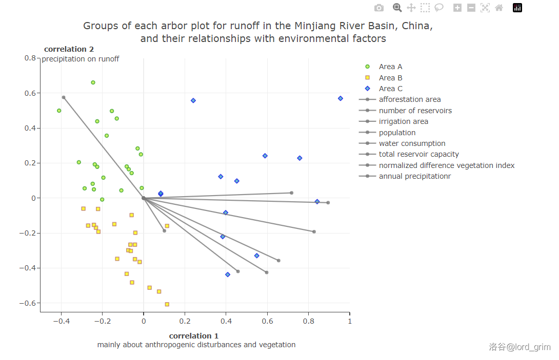
For comparison purposes, we show the original drawings from the essay here
2.4 improvement
- Erase non-data ink:
We delete the box around the figure and only keep the line at the bottom and left as x and y axes, while keeping the simple grid lines easy to locate(in the background). We noticed that because of the large number of data points, the annotation of the original image was too complicated for the readers. So we removed the text labeling of each point on the figure and displayed the scatter-related information in the information column of each point by using plotly library(Mouse over the point to see). - Make the visualization self-explanatory:
We marked the correlation coefficient of the point with the two conceptual axes (i.e. the positioning of the point on the graph) directly in the information column for each point, so that the reader can see the exact value directly, without having to look it up against the axes on the graph. We rewritten the abbreviated names of the factors indicated by the arrows in the diagram to the names of the corresponding factors, and modified the names of the coordinate axes to better reflect the meaning to be expressed. - Label points directly:
We have labeled each point with the relevant parameters, grouping and year of data in the point information column, which can be visualized by hovering over the point. The same operation is performed for the correlation factors vector line of the original graph. - Make vertical scale marks horizontal:
The value of the original picture was vertical in the vertical direction, so we changed it to horizontal for easy viewing. - Allow the reader to selectively highlight/simplify:
We label three sets of points grouped by region, eight driving factors of survey and other important information on the right side of the figure, by clicking on the select or cancel selection can choose or exclude in the visual display of information, so that the important information more outstanding, it also can reduce the reader's cognitive burden, make it easier for readers to get needed information. - Dynamic display :
By supporting the dynamic display of scatter information and grouping selective display, we enhance the interactive and interesting of visualization, and better reflect the information narrated in the figure. On the premise of not affecting the visual effect of the trend reflected in the original picture on the macro level, the expressive force of the data is enhanced on the micro level, and avoid some unwanted cognitive tunneling. - Legend style:
Since adding the description in front of the marker is not in keeping with the reader's reading habits, we have move label after the marker in the legend of improved figure to make it easier for the reader to read. - Horizontal y-axis name:
As the plotly library we are using cannot rotate or change the position of the y-axis title, we chose to use annotations to express the y-axis title, but the method of adding annotations in plotly does not move the content to relative coordinates where x or y is less than 0 (meaning it only exists to the right of the vertical axis). We finally set the y-axis name above the y-axis.
#Change the plotly canvas default template to remove background color
pio.templates.default = "none"
#gOne is data of area one
gOne = Data_df.loc[Data_df['categories'] == 1]
#gTwo is data of area two
gTwo = Data_df.loc[Data_df['categories'] == 2]
#gThree is data of area three
gThree = Data_df.loc[Data_df['categories'] == 3]
#Create lists to store the year
gOne1 = []
for i in gOne.year:
    gOne1.append("year:"+str(i))
gTwo1 = []
for i in gTwo.year:
    gTwo1.append("year:"+str(i))
gThree1 = []
for i in gThree.year:
    gThree1.append("year:"+str(i))

#create trace to draw visualization
trace1 =go.Scatter(
                    #set axis1 data of gOne dataset as x-axis to draw scatter plot
                    x = gOne.axis1,
                    #set axis2 data of gOne dataset as x-axis to draw scatter plot
                    y = gOne.axis2,
                    #We just need markers to draw dot in scatter plot
                    mode = "markers",
                    #Set name, color, symbol of marker, marker_size, and marker_line format of the graph
                    name = "Area A",
                    marker = dict(color = 'rgba(186, 239, 66, 0.8)', symbol='circle'),
                    marker_size = 6,
                    marker_line_width=1.5,
                    marker_line_color = 'rgba(59, 163, 47, 0.8)',
                    #Provide year data in the visualization (when you move your mouse on a dot)
                    text= gOne1)
#The following trace are similar with trace1, but draw other group of data.
trace2 =go.Scatter(
                    x = gTwo.axis1,
                    y = gTwo.axis2,
                    mode = "markers",
                    name = "Area B",
                    marker = dict(color = 'rgba(252, 254, 5, 0.8)', symbol='square'),
                    marker_size = 6,
                    marker_line_width=1.5,
                    marker_line_color = 'rgba(191, 125, 112, 0.8)',
                    text= gTwo1)

trace3 =go.Scatter(
                    x = gThree.axis1,
                    y = gThree.axis2,
                    mode = "markers",
                    name = "Area C",
                    marker = dict(color = 'rgba(64, 170, 200, 0.8)', symbol='diamond'),
                    marker_size = 6,
                    marker_line_width=1.5,
                    marker_line_color = 'rgba(21, 28, 232, 0.8)',
                    text= gThree1)

#lineDFx is data of x-axis to draw factor lines, lineDFy is the same
lineDFx = pd.DataFrame([[0, 0, 0, 0, 0, 0, 0, 0], [0, 0, 0, 0, 0, 0, 0, 0]], index=['start', 'end'], columns=range(1, 9))
for i in range(1, 9):
    tpValue = float(corCoef['corCx'][i])
    lineDFx.iloc[1, i-1] = tpValue
lineDFy = pd.DataFrame([[0, 0, 0, 0, 0, 0, 0, 0], [0, 0, 0, 0, 0, 0, 0, 0]], index=['start', 'end'], columns=range(1, 9))
for i in range(1, 9):
    tpValue = float(corCoef['corCy'][i])
    lineDFy.iloc[1, i-1] = tpValue

#Through the above change, we change the shape and index of origin data to make our following action more convenient.
#The following traces are aim to draw lines to show the factor. Detailed syntax is same as above.
#Factor line of afforestation area
traceAx1 = go.Scatter(
                    x = lineDFx[1],
                    y = lineDFy[1],
                    mode = "lines+markers",
                    name = "afforestation area",
                    marker = dict(color = 'rgba(120, 120, 120, 0.8)'),
                    text= 'afforestation area')

#Factor line of number of reservoirs
traceAx2 = go.Scatter(
                    x = lineDFx[2],
                    y = lineDFy[2],
                    mode = "lines+markers",
                    name = "number of reservoirs",
                    marker = dict(color = 'rgba(120, 120, 120, 0.8)'),
                    text= 'number of reservoirs')

#Factor ine of irrigation area
traceAx3 = go.Scatter(
                    x = lineDFx[3],
                    y = lineDFy[3],
                    mode = "lines+markers",
                    name = "irrigation area",
                    marker = dict(color = 'rgba(120, 120, 120, 0.8)'),
                    text= 'irrigation area')

#Factor line of population
traceAx4 = go.Scatter(
                    x = lineDFx[4],
                    y = lineDFy[4],
                    mode = "lines+markers",
                    name = "population",
                    marker = dict(color = 'rgba(120, 120, 120, 0.8)'),
                    text= 'population')

#Factor line of water consumption
traceAx5 = go.Scatter(
                    x = lineDFx[5],
                    y = lineDFy[5],
                    mode = "lines+markers",
                    name = "water consumption",
                    marker = dict(color = 'rgba(120, 120, 120, 0.8)'),
                    text= 'water consumption')

#Factor line of total reservoir capacity
traceAx6 = go.Scatter(
                    x = lineDFx[6],
                    y = lineDFy[6],
                    mode = "lines+markers",
                    name = "total reservoir capacity",
                    marker = dict(color = 'rgba(120, 120, 120, 0.8)'),
                    text= 'total reservoir capacity')

#Factor line of normalized difference vegetation index
traceAx7 = go.Scatter(
                    x = lineDFx[7],
                    y = lineDFy[7],
                    mode = "lines+markers",
                    name = "normalized difference vegetation index",
                    marker = dict(color = 'rgba(120, 120, 120, 0.8)'),
                    text= 'normalized difference vegetation index')

#Factor line of annual precipitationr
traceAx8 = go.Scatter(
                    x = lineDFx[8],
                    y = lineDFy[8],
                    mode = "lines+markers",
                    name = "annual precipitationr",
                    marker = dict(color = 'rgba(120, 120, 120, 0.8)'),
                    text= 'annual precipitation')

#data is the list of all the traces we need to add to figure
data = [trace1, trace2, trace3, traceAx1, traceAx2, traceAx3, traceAx4, traceAx5, traceAx6, traceAx7, traceAx8]
#Set
layout = dict(title = 'Groups of each arbor plot for runoff in the Minjiang River Basin, China, <br />  and their relationships with environmental factors',
              xaxis= dict(title= '<b> correlation 1 </b> <br> mainly about anthropogenic disturbances and vegetation',titlefont=dict(size=12), ticklen= 5, zeroline= False, showline=True),
              #yaxis= dict(title= 'correlation 2  <br \> (mainly about precipitation on runoff)',ticklen= 5,zeroline= False, showline=True),
              yaxis = dict(ticklen= 5,zeroline= False, showline=True),
              height = 620,
              width = 920
             )

annotation = [
              #Add annotation
              dict(
                   #Sets the position in relative coordinate
                   x=0,
                   xref='paper',
                   y=1.06,
                   yref='paper',
                   font = dict(size=12),
                   text='<b> correlation 2 </b>',
                   #Hide the arrow
                   showarrow=False,
                   ),
              dict(x=0,
                   xref='paper',
                   y=1.02,
                   yref='paper',
                   font = dict(size=12),
                   text='precipitation on runoff',
                   showarrow=False,
                   ),
             ]

#Draw the total figure, set traces as data and set layout
fig = go.Figure(data = data, layout = layout)
#Add annotations
fig.update_layout(xaxis_range=[-0.5, 1], yaxis_range=[-0.65,0.8], annotations= annotation)
#Show the figure
iplot(fig)
How to read it?
In this diagram all the physical characteristics remain the same as the original diagram, i.e. the 56 dots and 8 lines represent the same meaning. In this new and improved diagram, you can turn the three groups of dots and eight lines on and off by clicking the legend on the right, so that you can read the diagram more intuitively and understand its true meaning.(for example, if only retain the cluster of green points and the eight grey line segments, the graph will Visually show the extent to which this group of points is primarily influenced by the driver T_PREC (precipitation), which will be visualised by the contrast in lengths resulting from the projection of the points onto each of the grey line segments.)
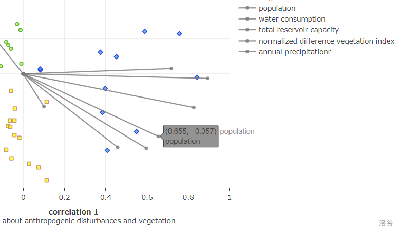
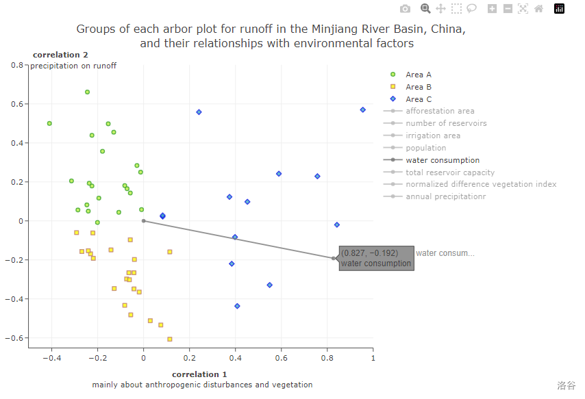
In addition, when the mouse is moved over an individual point or line segment, a corresponding floating window will be shown.
In the floating window for points, the coordinates represent the correlation coefficients between the runoff at the sampling points for the year and the two axes that can represent the driving factors, and the year represents the time when the points were taken.
In the floating window for the line, the coordinates represent the correlation coefficient between this driver and the two axes. It also show the full name of the driver.
Achievement exhibition
- Here is the overall preview of the visualization, without additional manipulation, to see all the scatter and factor lines.
- When we move the mouse over the points or the marker at the top of the factor line, we can see the details of what they represent.
- If we want to see the impact of only one impact factor on the runoff in different years, we can remove the lines of other factors by clicking on the label on the right.
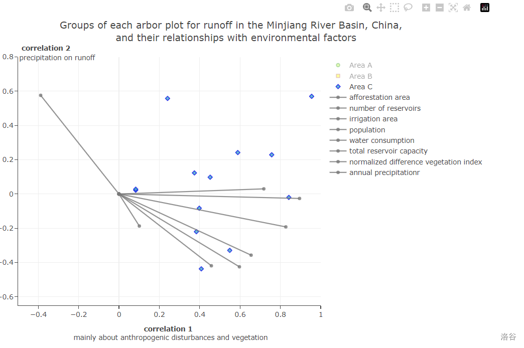
- Similarly, for different groups of scatters we can do the same action.
- The plotly library also supports other operations we can perform on this visualization (such as zooming in or out to get a better view).