标签:node nx pd python 网络图 df NetworkX import color
date: 2019-10-28 20:07:48 +0800
tags:
  - Python
  - 数据分析与可视化
NETWORK CHART(网络图)
代码下载地址
网络图 (或图表或图形)显示了一组实体之间的互连。每个实体由一个或多个节点表示。节点之间的连接通过链接(或边)表示。网络的理论与实现是一个广阔的研究领域。整个网络都可以致力于此。例如,网络可以是有向的或无向的,加权的或未加权的。有许多不同的输入格式。为了指导您该领域,我建议按照建议的顺序执行以下示例。请注意关于该工具,我主要依靠NetworkX库(2.4版本)。但是请注意,还应考虑使用Graph Tool,尤其是在涉及高维网络时。该章节主要内容有:
- 来自pandas基础网格图绘制 Basic Network from pandas data frame
- 自定义NetworkX图形外观 Custom NetworkX graph appearance
- 网络布局的可能性 Network layout possibilities
- 有向或无向网络 Directed or Undirected network
- 将颜色映射到网络节点 Map a color to network nodes
- 将颜色映射到网络的边 Map colour to the edges of a Network
- 网络图的背景颜色 Background colour of network chart
- 来自相关性矩阵的网络 Network from correlation matrix
NetworkX安装:
pip install networkx==2.4
本文参考:
https://python-graph-gallery.com/network-chart/
from IPython.core.interactiveshell import InteractiveShell
InteractiveShell.ast_node_interactivity = "all"
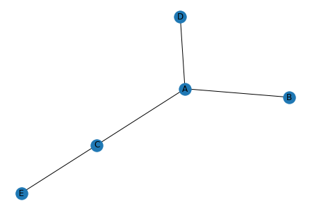
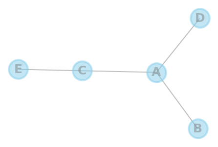
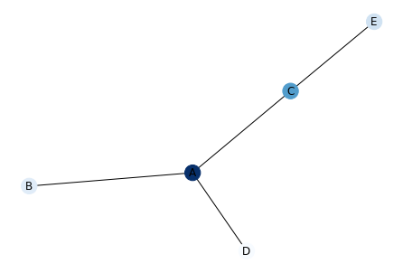
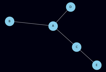
1. 自pandas基础网格图绘制 Basic Network from pandas data frame
该示例可能是您可以实现的最基本的网络图表。网络图由节点组成。这些节点通过边相互连接。因此,基本格式是数据帧,其中每行描述一个连接。在这里,我们用4条线构造一个数据框,描述此图的4个连接!因此,如果您的连接带有一个csv文件,请加载该文件并准备对其进行可视化!FROM表示起点,to表示终点。
# libraries 导入模块
import pandas as pd
import numpy as np
import networkx as nx
import matplotlib.pyplot as plt
# Build a dataframe with 4 connections
df = pd.DataFrame({ 'from':['A', 'B', 'C','A'], 'to':['D', 'A', 'E','C']})
df

# Build your graph
# 绘制网络图,每次结果可能不一样
G=nx.from_pandas_edgelist(df, 'from', 'to')

# Plot it
nx.draw(G, with_labels=True)
plt.show()
|
from |
to |
| 0 |
A |
D |
| 1 |
B |
A |
| 2 |
C |
E |
| 3 |
A |
C |
2. 自定义NetworkX图形外观 Custom NetworkX graph appearance
现在,让我们看一下自定义图表外观的参数。自定义分为三个主要类别:节点,节点标签和边:
- 节点 Nodes
- 标签 Labels
- 边 Edges
- 总结 All
## 节点 Nodes

# libraries 载入库
import pandas as pd
import numpy as np
import networkx as nx
import matplotlib.pyplot as plt

# Build a dataframe with your connections
df = pd.DataFrame({ 'from':['A', 'B', 'C','A'], 'to':['D', 'A', 'E','C']})
df

# Build your graph 建立表格
G=nx.from_pandas_edgelist(df, 'from', 'to')

# Graph with Custom nodes: 自定义表格
# with_labels是否显示标签,node_size节点大小,node_color节点颜色,node_shape节点形状,alpha透明度,linewidths线条宽度
nx.draw(G, with_labels=True, node_size=1500, node_color="skyblue", node_shape="s", alpha=0.5, linewidths=10)
plt.show()
|
from |
to |
| 0 |
A |
D |
| 1 |
B |
A |
| 2 |
C |
E |
| 3 |
A |
C |
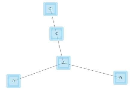
## 标签 Labels
# libraries
import pandas as pd
import numpy as np
import networkx as nx
import matplotlib.pyplot as plt

# Build a dataframe with your connections
df = pd.DataFrame({ 'from':['A', 'B', 'C','A'], 'to':['D', 'A', 'E','C']})
df

# Build your graph
G=nx.from_pandas_edgelist(df, 'from', 'to')

# Custom the edges:
# font_size标签字体大小,font_color标签字体颜色,font_weight字体形式
nx.draw(G, with_labels=True, node_size=1500, font_size=25, font_color="yellow", font_weight="bold")
plt.show()
|
from |
to |
| 0 |
A |
D |
| 1 |
B |
A |
| 2 |
C |
E |
| 3 |
A |
C |
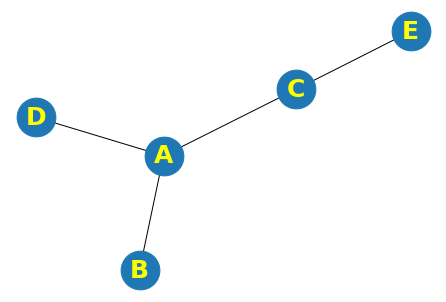
## 边 Edges
# libraries
import pandas as pd
import numpy as np
import networkx as nx
import matplotlib.pyplot as plt

# Build a dataframe with your connections
df = pd.DataFrame({ 'from':['A', 'B', 'C','A'], 'to':['D', 'A', 'E','C']})
df

# Build your graph
G=nx.from_pandas_edgelist(df, 'from', 'to')

# Chart with Custom edges:
# width边线条宽,edge_color边线条颜色
nx.draw(G, with_labels=True, width=10, edge_color="skyblue", style="solid")
|
from |
to |
| 0 |
A |
D |
| 1 |
B |
A |
| 2 |
C |
E |
| 3 |
A |
C |
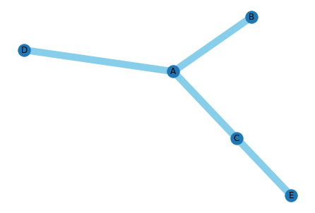
## 总结 All
# libraries
import pandas as pd
import numpy as np
import networkx as nx
import matplotlib.pyplot as plt

# Build a dataframe with your connections
df = pd.DataFrame({ 'from':['A', 'B', 'C','A'], 'to':['D', 'A', 'E','C']})
df

# Build your graph
G=nx.from_pandas_edgelist(df, 'from', 'to')

# All together we can do something fancy
nx.draw(G, with_labels=True, node_size=1500, node_color="skyblue", node_shape="o", alpha=0.5, linewidths=4, font_size=25, font_color="grey", font_weight="bold", width=2, edge_color="grey")
|
from |
to |
| 0 |
A |
D |
| 1 |
B |
A |
| 2 |
C |
E |
| 3 |
A |
C |
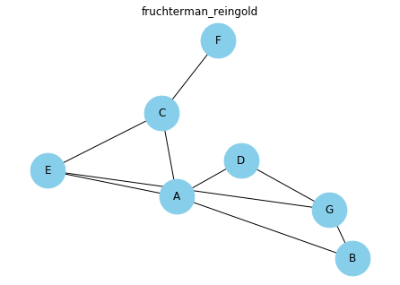
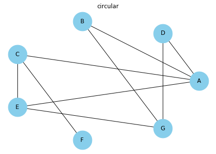
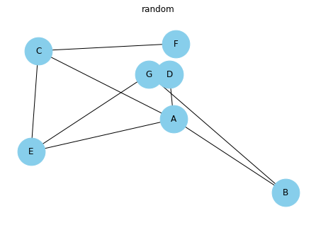
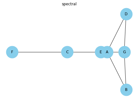
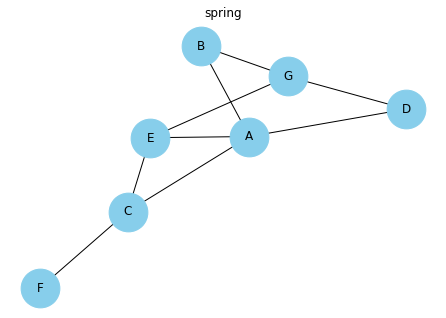
3. 网络布局的可能性 Network layout possibilities
实际上,有一种算法可以计算每个节点的最佳位置。NetworkX已开发并提出了几种算法。此页面通过采用相同的小型数据集并对其应用不同的布局算法来说明此概念。如果您不知道哪一个最适合您,则默认情况下将其设置为默认值!默认Spring布局
# libraries
import pandas as pd
import numpy as np
import networkx as nx
import matplotlib.pyplot as plt

# Build a dataframe with your connections
df = pd.DataFrame({ 'from':['A', 'B', 'C','A','E','F','E','G','G','D','F'], 'to':['D', 'A', 'E','C','A','F','G','D','B','G','C']})
df

# Build your graph
G=nx.from_pandas_edgelist(df, 'from', 'to')
|
from |
to |
| 0 |
A |
D |
| 1 |
B |
A |
| 2 |
C |
E |
| 3 |
A |
C |
| 4 |
E |
A |
| 5 |
F |
F |
| 6 |
E |
G |
| 7 |
G |
D |
| 8 |
G |
B |
| 9 |
D |
G |
| 10 |
F |
C |
# Fruchterman Reingold Fruchterman Reingold引导布局算法布局
nx.draw(G, with_labels=True, node_size=1500, node_color="skyblue", pos=nx.fruchterman_reingold_layout(G))
plt.title("fruchterman_reingold")
Text(0.5, 1.0, 'fruchterman_reingold')
# Circular 环形布局
nx.draw(G, with_labels=True, node_size=1500, node_color="skyblue", pos=nx.circular_layout(G))
plt.title("circular")
Text(0.5, 1.0, 'circular')
# Random 随机布局
nx.draw(G, with_labels=True, node_size=1500, node_color="skyblue", pos=nx.random_layout(G))
plt.title("random")
Text(0.5, 1.0, 'random')
# Spectral 光谱式布局
nx.draw(G, with_labels=True, node_size=1500, node_color="skyblue", pos=nx.spectral_layout(G))
plt.title("spectral")
Text(0.5, 1.0, 'spectral')
# Spring 跳跃式布局
nx.draw(G, with_labels=True, node_size=1500, node_color="skyblue", pos=nx.spring_layout(G))
plt.title("spring")
Text(0.5, 1.0, 'spring')
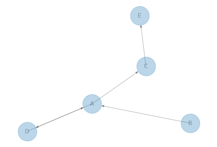
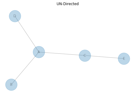
4. 有向或无向网络 Directed or Undirected network
网络图可以在2个主要类别进行分割:有向网络和无向网络。如果它是定向的,那么在两个节点之间就有一个流的概念,这样就留下了一个去其他地方的地方。就像钱从A公司流向B公司一样。这就是为什么你可以看到(某种程度上)左边图表上的箭头,它给出了方向。例如,流量从B流向A。如果它是无向的,则这两个节点之间只有一个链接,例如,先生A和先生B是朋友。
生成图形时,必须使用适合您需要的函数:Graph()用于无向(默认),DiGraph用于有向图
# libraries
import pandas as pd
import numpy as np
import networkx as nx
import matplotlib.pyplot as plt

##  DIRECTED 有向图

# Build a dataframe with your connections
# This time a pair can appear 2 times, in one side or in the other!
df = pd.DataFrame({ 'from':['D', 'A', 'B', 'C','A'], 'to':['A', 'D', 'A', 'E','C']})
df

# Build your graph. Note that we use the DiGraph function to create the graph!
# create_using=nx.DiGraph()创建有向图,默认是无向图
G=nx.from_pandas_edgelist(df, 'from', 'to', create_using=nx.DiGraph())

# Make the graph 有向图
nx.draw(G, with_labels=True, node_size=1500, alpha=0.3, arrows=True)
|
from |
to |
| 0 |
D |
A |
| 1 |
A |
D |
| 2 |
B |
A |
| 3 |
C |
E |
| 4 |
A |
C |
# UNDIRECTED 无向图

# Build a dataframe with your connections
# This time a pair can appear 2 times, in one side or in the other!
df = pd.DataFrame({ 'from':['D', 'A', 'B', 'C','A'], 'to':['A', 'D', 'A', 'E','C']})
df

# Build your graph. Note that we use the Graph function to create the graph!
G=nx.from_pandas_edgelist(df, 'from', 'to', create_using=nx.Graph())

# Make the graph
nx.draw(G, with_labels=True, node_size=1500, alpha=0.3, arrows=True)
plt.title("UN-Directed")
|
from |
to |
| 0 |
D |
A |
| 1 |
A |
D |
| 2 |
B |
A |
| 3 |
C |
E |
| 4 |
A |
C |
Text(0.5, 1.0, 'UN-Directed')
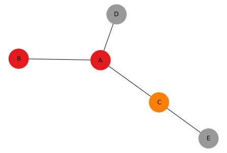
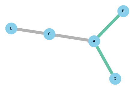
5. 将颜色映射到网络节点 Map a color to network nodes
一个常见的任务是按照节点的功能为网络图表的每个节点着色(我们称其为映射颜色)。它允许在图表中显示更多信息。有两种可能性:
- 您要映射的要素是一个数值。然后,我们将使用连续的色标。在左图上,A比C暗,比B暗。
- 该功能是分类的。在右图上,A和B属于同一组,D和E分组在一起,而C在他的组中单独存在。我们使用了分类色标。
通常我们使用2个表。第一个提供节点之间的链接。第二个提供每个节点的功能。您可以如下链接这两个文件。
## Continuous color scale 连续颜色
# libraries
import pandas as pd
import numpy as np
import networkx as nx
import matplotlib.pyplot as plt

# Build a dataframe with your connections
df = pd.DataFrame({ 'from':['A', 'B', 'C','A'], 'to':['D', 'A', 'E','C']})

# And a data frame with characteristics for your nodes
carac = pd.DataFrame({ 'ID':['A', 'B', 'C','D','E'], 'myvalue':['123','25','76','12','34'] })
# 设置值
carac
# Build your graph 建立图
G =nx.from_pandas_edgelist(df, 'from', 'to', create_using=nx.Graph() )

# The order of the node for networkX is the following order:
# 节点顺序
G.nodes()
# Thus, we cannot give directly the 'myvalue' column to netowrkX, we need to arrange the order!
# Here is the tricky part: I need to reorder carac, to assign the good color to each node
# 根据myvalue设置颜色,并匹配节点顺序和ID号
carac = carac.set_index('ID')
carac =carac.reindex(G.nodes())
carac
# Plot it, providing a continuous color scale with cmap:
# node_color设定颜色,输入的必须是float数组或者int值;cmap颜色条
nx.draw(G, with_labels=True, node_color=np.array(carac['myvalue'].values,dtype='float32'), cmap=plt.cm.Blues)
|
ID |
myvalue |
| 0 |
A |
123 |
| 1 |
B |
25 |
| 2 |
C |
76 |
| 3 |
D |
12 |
| 4 |
E |
34 |
NodeView(('A', 'D', 'B', 'C', 'E'))
|
myvalue |
| ID |
|
| A |
123 |
| D |
12 |
| B |
25 |
| C |
76 |
| E |
34 |
## Categorical color scale 连续颜色
# libraries
import pandas as pd
import numpy as np
import networkx as nx
import matplotlib.pyplot as plt

# Build a dataframe with your connections
df = pd.DataFrame({ 'from':['A', 'B', 'C','A'], 'to':['D', 'A', 'E','C']})

# And a data frame with characteristics for your nodes
carac = pd.DataFrame({ 'ID':['A', 'B', 'C','D','E'], 'myvalue':['group1','group1','group2','group3','group3'] })

# Build your graph
# 建立图
G=nx.from_pandas_edgelist(df, 'from', 'to', create_using=nx.Graph() )

# The order of the node for networkX is the following order:
# 打印节点顺序
G.nodes()
# Thus, we cannot give directly the 'myvalue' column to netowrkX, we need to arrange the order!

# Here is the tricky part: I need to reorder carac to assign the good color to each node
carac= carac.set_index('ID')
# 根据节点顺序设定值
carac=carac.reindex(G.nodes())

# And I need to transform my categorical column in a numerical value: group1->1, group2->2...
# 设定类别
carac['myvalue']=pd.Categorical(carac['myvalue'])
carac['myvalue'].cat.codes

# Custom the nodes:
nx.draw(G, with_labels=True, node_color=carac['myvalue'].cat.codes, cmap=plt.cm.Set1, node_size=1500)
NodeView(('A', 'D', 'B', 'C', 'E'))


ID
A    0
D    2
B    0
C    1
E    2
dtype: int8
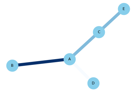
6. 将颜色映射到网络的边 Map colour to the edges of a Network
我们假设我们对网络的每个边缘都有一个功能,例如,此功能可以是此链接表示的金额(数字值),也可以是发生在哪个洲(类别值)。我们希望边缘根据此变量而有所不同。
- 数值型 numerical
- 类别型 categorical
## 数值型 numerical
# libraries
import pandas as pd
import numpy as np
import networkx as nx
import matplotlib.pyplot as plt

# Build a dataframe with your connections
# value设定链接值
df = pd.DataFrame({ 'from':['A', 'B', 'C','A'], 'to':['D', 'A', 'E','C'], 'value':[1, 10, 5, 5]})
df

# Build your graph
G=nx.from_pandas_edgelist(df, 'from', 'to', create_using=nx.Graph() )

# Custom the nodes:
# edge_color设置边的颜色
nx.draw(G, with_labels=True, node_color='skyblue', node_size=1500, edge_color=df['value'], width=10.0, edge_cmap=plt.cm.Blues)
|
from |
to |
value |
| 0 |
A |
D |
1 |
| 1 |
B |
A |
10 |
| 2 |
C |
E |
5 |
| 3 |
A |
C |
5 |
## 类别型 categorical
# libraries
import pandas as pd
import numpy as np
import networkx as nx
import matplotlib.pyplot as plt

# Build a dataframe with your connections
# value设置类型
df = pd.DataFrame({ 'from':['A', 'B', 'C','A'], 'to':['D', 'A', 'E','C'], 'value':['typeA', 'typeA', 'typeB', 'typeB']})
df

# And I need to transform my categorical column in a numerical value typeA->1, typeB->2...
# 转换为类别
df['value']=pd.Categorical(df['value'])
df['value'].cat.codes

# Build your graph
G=nx.from_pandas_edgelist(df, 'from', 'to', create_using=nx.Graph() )

# Custom the nodes:
nx.draw(G, with_labels=True, node_color='skyblue', node_size=1500, edge_color=df['value'].cat.codes, width=10.0, edge_cmap=plt.cm.Set2)
|
from |
to |
value |
| 0 |
A |
D |
typeA |
| 1 |
B |
A |
typeA |
| 2 |
C |
E |
typeB |
| 3 |
A |
C |
typeB |
0    0
1    0
2    1
3    1
dtype: int8
7. 网络图的背景颜色 Background colour of network chart
你可以改变背景颜色您的网络图与 fig.set_facecolor()。 请注意,如果要保留png的背景色,则需要添加fig.get_facecolor。
# libraries
import pandas as pd
import numpy as np
import networkx as nx
import matplotlib.pyplot as plt

# Build a dataframe with your connections
df = pd.DataFrame({ 'from':['A', 'B', 'C','A'], 'to':['D', 'A', 'E','C'] })
df

# Build your graph
G=nx.from_pandas_edgelist(df, 'from', 'to', create_using=nx.Graph() )

# Custom the nodes:
fig = plt.figure()
nx.draw(G, with_labels=True, node_color='skyblue', node_size=1500, edge_color='white')
# 设置背景颜色
fig.set_facecolor("#00000F")

# If you want to save the figure to png:
# 保存图像需要设定facecolor=fig.get_facecolor() ,否者背景颜色为白色
# plt.savefig('yourname.png', facecolor=fig.get_facecolor(),dpi=300)
|
from |
to |
| 0 |
A |
D |
| 1 |
B |
A |
| 2 |
C |
E |
| 3 |
A |
C |
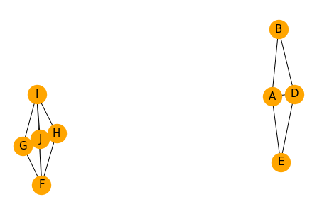
8. 来自相关性矩阵的网络 Network from correlation matrix
本页说明了如何绘制相关网络:基于相关矩阵构建的网络。假设您有10个人,并且知道他们彼此之间的亲密关系。可以在网络中表示这些关系。每个人都是一个节点。如果2个人足够接近(我们设定了一个阈值),则它们由边链接。那将显示人口结构!
# libraries
import pandas as pd
import numpy as np
import networkx as nx
import matplotlib.pyplot as plt

# I build a data set: 10 individuals and 5 variables for each
ind1=[5,10,3,4,8,10,12,1,9,4]
ind5=[1,1,13,4,18,5,2,11,3,8]
# 建立矩阵
df = pd.DataFrame({ 'A':ind1, 'B':ind1 + np.random.randint(10, size=(10)) , 'C':ind1 + np.random.randint(10, size=(10)) , 'D':ind1 + np.random.randint(5, size=(10)) , 'E':ind1 + np.random.randint(5, size=(10)), 'F':ind5, 'G':ind5 + np.random.randint(5, size=(10)) , 'H':ind5 + np.random.randint(5, size=(10)), 'I':ind5 + np.random.randint(5, size=(10)), 'J':ind5 + np.random.randint(5, size=(10))})
df

# Calculate the correlation between individuals. We have to transpose first, because the corr function calculate the pairwise correlations between columns.
# 计算相关性
corr = df.corr()
corr

# Transform it in a links data frame (3 columns only):
# 将相关系数矩阵压平
links = corr.stack().reset_index()
# 设置列名
links.columns = ['var1', 'var2','value']
#links

# Keep only correlation over a threshold and remove self correlation (cors (A,A)=1)
# 剔除相同编号的行以及相关系数小于0.8的行
links_filtered=links.loc[ (links['value'] > 0.8) & (links['var1'] != links['var2']) ]
#links_filtered

# Build your graph
# 作图
G=nx.from_pandas_edgelist(links_filtered, 'var1', 'var2')

# Plot the network:
nx.draw(G, with_labels=True, node_color='orange', node_size=500, edge_color='black', linewidths=5, font_size=15)
|
A |
B |
C |
D |
E |
F |
G |
H |
I |
J |
| 0 |
5 |
13 |
6 |
8 |
8 |
1 |
4 |
2 |
1 |
3 |
| 1 |
10 |
19 |
10 |
14 |
12 |
1 |
3 |
4 |
4 |
5 |
| 2 |
3 |
9 |
3 |
5 |
3 |
13 |
17 |
13 |
14 |
15 |
| 3 |
4 |
6 |
5 |
4 |
5 |
4 |
7 |
4 |
7 |
4 |
| 4 |
8 |
13 |
9 |
12 |
10 |
18 |
19 |
19 |
20 |
19 |
| 5 |
10 |
13 |
13 |
11 |
11 |
5 |
8 |
9 |
7 |
9 |
| 6 |
12 |
16 |
14 |
15 |
13 |
2 |
2 |
3 |
6 |
3 |
| 7 |
1 |
7 |
6 |
3 |
4 |
11 |
14 |
14 |
14 |
11 |
| 8 |
9 |
11 |
9 |
9 |
9 |
3 |
4 |
5 |
7 |
5 |
| 9 |
4 |
9 |
4 |
7 |
4 |
8 |
8 |
8 |
10 |
8 |
|
A |
B |
C |
D |
E |
F |
G |
H |
I |
J |
| A |
1.000000 |
0.816480 |
0.901905 |
0.936634 |
0.949857 |
-0.409401 |
-0.505922 |
-0.327200 |
-0.325622 |
-0.276172 |
| B |
0.816480 |
1.000000 |
0.706978 |
0.928908 |
0.876425 |
-0.380840 |
-0.440560 |
-0.291830 |
-0.369119 |
-0.214817 |
| C |
0.901905 |
0.706978 |
1.000000 |
0.830659 |
0.926892 |
-0.343944 |
-0.416735 |
-0.200915 |
-0.245105 |
-0.230368 |
| D |
0.936634 |
0.928908 |
0.830659 |
1.000000 |
0.939070 |
-0.282163 |
-0.397256 |
-0.212778 |
-0.229146 |
-0.151093 |
| E |
0.949857 |
0.876425 |
0.926892 |
0.939070 |
1.000000 |
-0.412766 |
-0.488815 |
-0.301198 |
-0.346611 |
-0.278961 |
| F |
-0.409401 |
-0.380840 |
-0.343944 |
-0.282163 |
-0.412766 |
1.000000 |
0.972397 |
0.968543 |
0.975579 |
0.965554 |
| G |
-0.505922 |
-0.440560 |
-0.416735 |
-0.397256 |
-0.488815 |
0.972397 |
1.000000 |
0.952668 |
0.923379 |
0.957782 |
| H |
-0.327200 |
-0.291830 |
-0.200915 |
-0.212778 |
-0.301198 |
0.968543 |
0.952668 |
1.000000 |
0.956089 |
0.973569 |
| I |
-0.325622 |
-0.369119 |
-0.245105 |
-0.229146 |
-0.346611 |
0.975579 |
0.923379 |
0.956089 |
1.000000 |
0.927947 |
| J |
-0.276172 |
-0.214817 |
-0.230368 |
-0.151093 |
-0.278961 |
0.965554 |
0.957782 |
0.973569 |
0.927947 |
1.000000 |
标签:node,
nx,
pd,
python,
网络图,
df,
NetworkX,
import,
color
From: https://www.cnblogs.com/luohenyueji/p/16991239.html