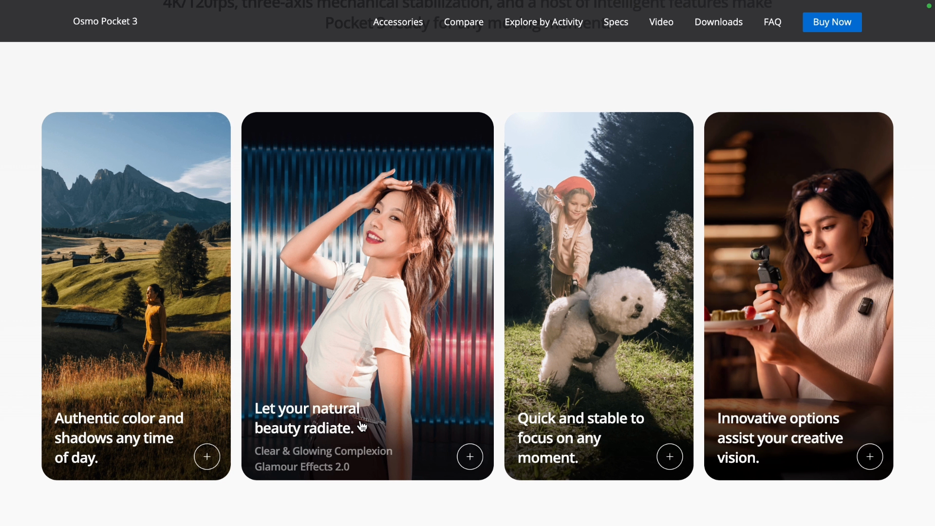
The cards on the DJI site have an effect where the hovered card expands and the other cards shrink:

In order to emulate this effect we'll use Flexbox.
We'll start by adding the classes flex-1 and hover:grow-[2] to the li element, and removing the group-hover class.
The flex-1 class acts similarly to fr, which is a unit relative to the available space. Since all of the li items have flex-1, they take equal parts divided by 4.
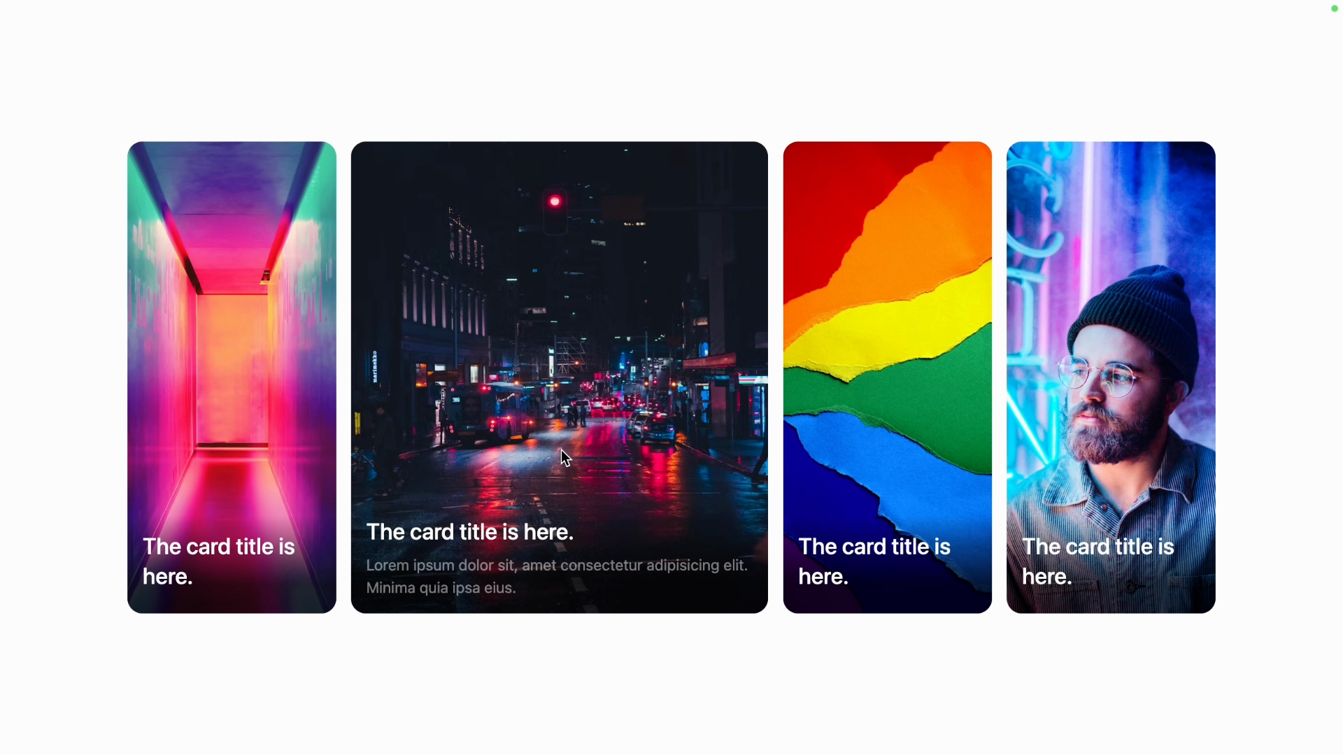
When we hover, the hover:grow-[2] class sets the flex-grow to 2, which means that the hovered card will take up twice the space of the other cards:
<li
  key={index}
  class="group relative h-[500px] w-full overflow-hidden rounded-2xl bg-rose-300 flex-1 hover:grow-[2]"
>
You can see here that the hovered card is taking up a lot of space.
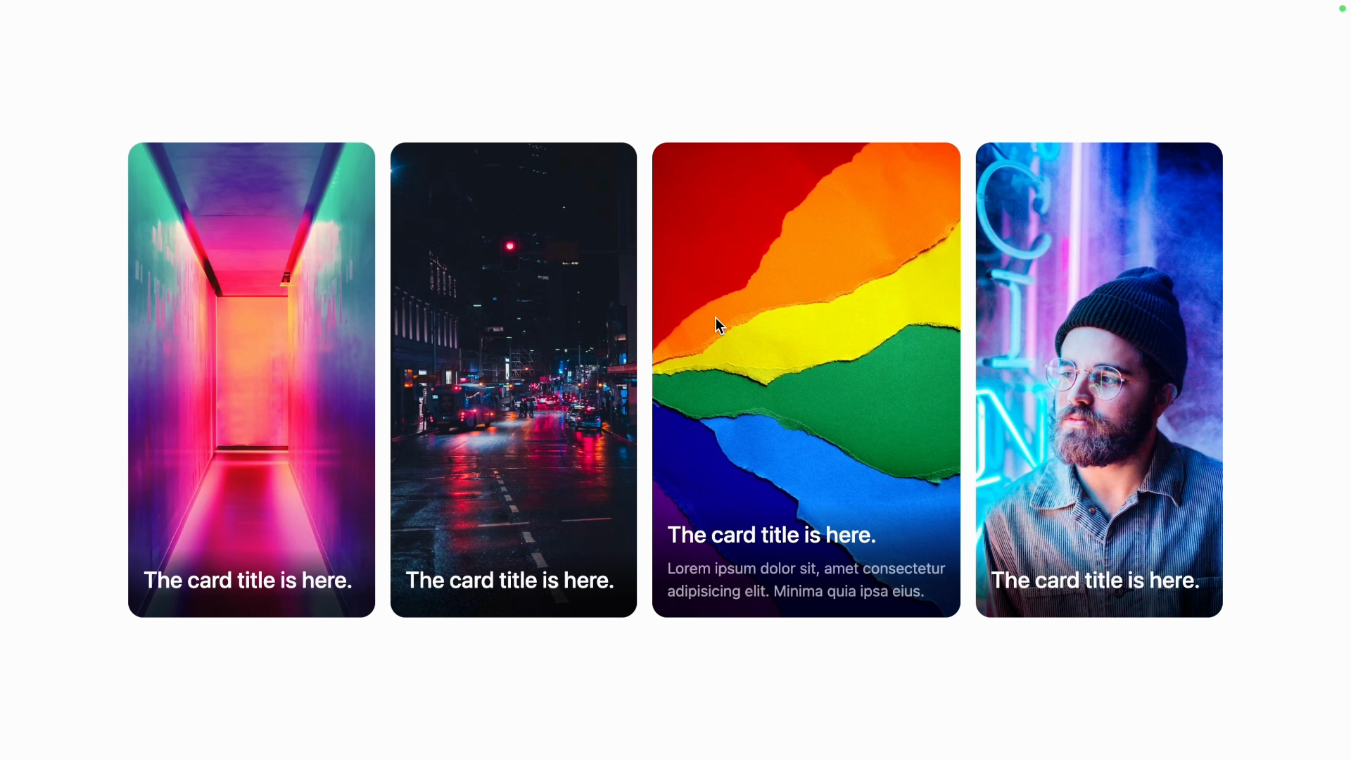
Adjusting hover:grow- to 1.25 will make for a more subtle effect:
<li
  key={index}
  class="group relative h-[500px] w-full overflow-hidden rounded-2xl bg-rose-300 flex-1 hover:grow-[1.25]"
>
