标签:node control form ComboBox drop focus down TreeView 下拉菜单
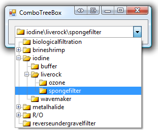
A ComboBox with a TreeView Drop-Down
Posted on
November 4, 2010

That’s right, exactly what it says on the box. But why do we need a control like this? Well, it’s a need that i’ve come across many times, in fact, and applies when:
- You have hierarchical data
- You want the user to make a selection
- You don’t have enough room to use a TreeView control
- You don’t expect the selection to be changed often…
- …but when it is, a dialog box is too clunky and interrupting
In these situations, a regular ComboBox just won’t cut the mustard; it doesn’t show the structure of your data and its drop-down shows every item, whether you like it or not.
I have explored the challenges associated with writing a control like this in Windows Forms at great length, and i’d like to share the common pitfalls as well as the ultimate solution, which revolves around the ToolStripDropDown control.
What is a drop-down, really?
Most people, when considering this question, would immediately tell you that a drop-down is a Form. After all, it exhibits a lot of the behaviour of a form:
- It can spill over outside the client area of its parent form
- It can independently process mouse and keyboard input
- It can appear top-most; other windows do not obscure it
However, this assessment is fundamentally incorrect. Drop-downs do some very un-Form-like things:
- When they open, they do not take focus away from the parent form
- When they capture mouse/keyboard input, they do not take focus away from the parent form
- Interacting with their child controls/items does not switch focus
So, how does one achieve this behaviour? Those last few points seem to represent a drastic departure from the way forms and controls work!
How to get it wrong
With that in mind, here are some great ways to fail at implementing drop-downs in Windows Forms:
Use a Form (ignorantly)
So, you decide to implement your drop-down as a Form. You make it borderless, suppress it from the taskbar, perhaps make it TopMost as well. You might even make it an owned form. Whatever the particulars, your users click the drop-down button and the form is shown. There’s a slight flicker/flash as focus switches to the drop-down’s form. The parent form’s title bar changes colour and its drop-shadow (under Aero) narrows. The user makes their selection via the controls on the drop-down form and it closes. Focus isn’t restored to the parent form. Keyboard input ceases to have any effect, so the user can’t tab to the next control. As soon as they click on the parent form again, focus changes, the title bar changes colour and the drop shadow expands. There might be an unsightly flicker too. And if you think it looks passable, try opening and closing the drop-down several times in quick succession. Overall result? Loads of superfluous clicks and a very poor user experience.
Use a Form and try to be clever
Those who have tried the above (or arrive at the problem possessing a better understanding of WinForms/Win32) will try to solve the initial problem first; that is, that the drop-down’s form takes focus away from the parent form. A well-kept secret about the Form class is that it has a protected property called ShowWithoutActivation, which (in most cases) will skip the activation of the form when it is shown:
1 |
protected override bool ShowWithoutActivation { |
In those situations where ShowWithoutActivation has no effect, you can forcefully set the WS_EX_NOACTIVATE flag on control’s style by overriding the CreateParams property:
1 |
protected override CreateParams CreateParams { |
3 |
const int WS_EX_NOACTIVATE = 0x08000000; |
5 |
CreateParams p = base.CreateParams; |
6 |
p.ExStyle |= WS_EX_NOACTIVATE; |
Mind you, these do nothing to prevent the form from gaining focus once it is visible; so merely clicking on your form will bring the whole problem to light again. So, having succeeded in preventing the form from taking focus when it is displayed, the next challenge is to prevent it from ever getting focus. The most commonly-used technique for this is to go all Win32 and start intercepting window messages. Specifically, the response to the WM_MOUSEACTIVATE message (which is sent to the form when it is clicked, but doesn’t have focus) is set to MA_NOACTIVATE (which processes the click without changing focus):
1 |
protected override void DefWndProc(ref Message m) { |
2 |
const int WM_MOUSEACTIVATE = 0x21; |
3 |
const int MA_NOACTIVATE = 0x0003; |
5 |
if (m.Msg == WM_MOUSEACTIVATE) |
6 |
m.Result = (IntPtr)MA_NOACTIVATE; |
8 |
base.DefWndProc(ref m); |
This actually works; clicking the drop-down’s form will not cause focus to change. The problem is, your drop-down isn’t just going to consist of the form itself. Clicking any control on the form will give focus to the drop-down’s form, undoing all your good work. You can replicate the message interception technique for every control on your form, but some controls (e.g. the TreeView) won’t play ball. Selecting a TreeNode, for example, will always set focus.
So, at the end of all this fuss, you’re left with a series of subclassed controls and low-level code. And what does it get you? A drop-down that will give you a nice user experience… as long as you don’t actually click on it. Ultimately useless.
Use a Control instead
Finally, you might think that using a Control and adding it to the parent form might be a clever way of avoiding issues with focus… and yes, it does completely mitigate that problem. Unfortunately, you’re now left with a drop-down that can’t extend beyond the parent form’s client area. You might think this is fine, so long as your drop-down control has plenty of space below it on the form… but doesn’t that completely defeat the purpose of having a drop-down in the first place? This ‘solution’ is also a dud.
Enter, ToolStripDropDown
In fact, when you look into the behaviours exhibited by drop-downs, it becomes apparent that they are more like menus than forms. Menus can independently process keyboard and mouse input without taking focus away from their parent windows. So, let’s look to the most obvious example in the framework; the ContextMenuStrip control. It’s a Control by inheritance only; in all other respects, it behaves like a Component. Importantly, though, it’s not a Form – and therefore avoids the issues with focus. In fact, menus represent a third class of focus when compared to other elements:
- Forms take focus from their parent, but also have a separate notion of focus for their controls.
- Controls take focus from their parent, but surrender it to their children.
- Menus share focus with their parent and children.
This behaviour represents exactly what we want out of a drop-down, however the ContextMenuStrip has a very specific purpose. Looking into its inheritance chain, we can find ToolStrip, ToolStripDropDown and ToolStripDropDownMenu. The first doesn’t represent a menu, so that’s no use to us. The second is the base class for a drop-down, which makes a good start. It’s worthwhile to note that ToolStripDropDown doesn’t support scrolling (whereas its next descendant does), however with the method i’m going to use to implement my drop-down, automatic scrolling support won’t be necessary.
Any derivative of ToolStripItem (labels, buttons, etc) can be added to a drop-down, including ToolStripControlHost (although i’ve elected not to simply host a TreeView control inside the drop-down – there are still some quirky focus issues in doing this, not to mention the overheads involved). The drop-down itself must contain at least one item, even if it takes up no space. Being a descendant of Control, it can be painted by overriding the OnPaint method and can respond to mouse and keyboard events as well. Combined with the non-focusing behaviour, this gives us all the tools necessary to create a drop-down that behaves as expected.
Implementation
The full functionality of the TreeView is not required for this drop-down control, so a similar (but simplified) data model will form the basis of the implementation.

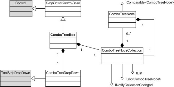
DropDownBase contains the basic functionality for the editable portion of the control; painting, event handling and design-time support, as well as management of the DroppedDown state. The data model centers around ComboTreeNode, which is akin to TreeNode. The circular relationship between it and its collection type, ComboTreeNodeCollection, creates the tree structure. ComboTreeBox is the primary implementation of DropDownBase. It holds and controls the data model, and visualises the selected node. It also holds ComboTreeDropDown, the actual drop-down (descended from ToolStripDropDown).
In this implementation, the data model is completely separated from the view; nodes can be defined and manipulated independently of the control/drop-down.
Model – ComboTreeNode and ComboTreeNodeCollection
ComboTreeNode is a simple, atomic class used to hold the node’s name, text, state and model its relationship to the other nodes in the tree. ComboTreeNodeCollection represents a sub-tree, and is therefore associated with an owning node. The only exception to this rule is for sub-trees which have not yet been added to the control, and the root collection which belongs to the control. Neither class depends upon ComboTreeBox, however both take on additional properties and behaviours once added to the control.
ComboTreeNodeCollection implements IList<ComboTreeNode>, because the order of the nodes is important. An inner List<ComboTreeNode> is used as the backing store. The collection is responsible for assigning each node’s parent, as well as ensuring that CollectionChanged event (from INotifyCollectionChanged) is fired recursively up the tree:
01 |
public void Add(ComboTreeNode item) { |
06 |
item.Nodes.CollectionChanged += this.CollectionChanged; |
08 |
new NotifyCollectionChangedEventArgs(NotifyCollectionChangedAction.Add, item) |
It also implements the non-generic IList to provide compatibility with CollectionEditor, used by the Windows Forms Designer.
View – The drop-down itself
ComboTreeDropDown is responsible for displaying and providing interaction with the data model.Visually, the nodes can be represented as a series of rows, whose bounds are determined by their Depth in the tree, and whose visibility is determined by whether their Parent node is expanded. The visibility of each node is determined by recursively checking the Expanded property of the node’s parents; a node is visible only if the path to the root of the tree contains no collapsed nodes:
01 |
internal bool IsNodeVisible(ComboTreeNode node) { |
02 |
bool displayed = true; |
03 |
ComboTreeNode parent = node; |
04 |
while ((parent = parent.Parent) != null) { |
05 |
if (!parent.Expanded) { |
Rendering
A reasonably simple set of rules govern how the connectors between nodes in the tree are drawn – in fact, it’s possible to isolate the different permutations and cache the resulting bitmaps in order to save on processing and memory (these permutations are represented using the BitmapInfo structure). The superset of visible nodes changes whenever a node is expanded or collapsed, or if nodes are added/removed from the tree. Changes to the size and font of the owning control will also cause the set to be re-evaluated.
Scrolling
Scrolling is implemented manually, on a very simple principle: A contiguous subset of the visible nodes, the size of which is determined by the maximum height of the drop-down, is selected using an offset.
- The range of the scroll bar is equal to the total number of visible items, minus the size of the largest subset that can be displayed in the drop-down.
- The position of the scroll bar can be expressed as a percentage of the offset, relative to the range.
- The size of the ‘thumb’ on the scroll bar is equal to the size of the scroll range as a proportion of the total number of visible items.
To actually render the drop-down, then, the visible nodes within the scroll range are positioned, relative to the top. The visual properties of each node are represented using NodeInfo. There are two painting operations per node; the (cached) bitmap which represents the indentation, node image, glyphs & connectors, and the text on the node. If the number of nodes in the scroll range is less than the total number of visible nodes, the scrollbar is painted too.
The bounds for drawing each node and part of the scroll bar (stored using ScrollBarInfo) are also used when responding to mouse events. If the mouse pointer falls within the bounds of an item, the associated ComboTreeNode can be determined. Clicking the plus/minus glyph beside a node causes it to collapse/expand, whereas clicking anywhere else on the node will change the selection and close the drop-down. (It’s worthwhile to note that some mouse features, such as dragging the scroll bar and holding down a button with auto-repeat behaviour, are somewhat complex and fall outside the scope of this overview. I will, however, mention the most noteworthy quirk – the MouseWheel event for the drop-down can only be handled on the owning control.)
Highlighted item vs. selected node
Each time the drop-down is displayed, it scrolls to (and highlights) the node corresponding to the SelectedNode property of the owning control. The highlighted item is a separate concept to the selected node, as is the case in an ordinary ComboBox‘s drop-down. These rules apply:
- Moving the mouse over an item causes it to become highlighted, however the selected node does not change unless the item is clicked.
- Navigating with the keyboard (up/down) changes both the highlighted item and the selected node.
- Scrolling (with either the mouse wheel, keyboard (page up/page down) or using the scroll bar) changes neither the highlighted or selected items.
Controller – The owning control
ComboTreeBox is the controller in this implementation. In addition to holding the data model and providing access to the view, it exposes operations for manipulating both – bringing the whole concept together into a reusable Windows Forms control. As such, it combines aspects of behaviour from both the ComboBox and TreeView controls:
- The ability to assign a Name to each node, which can be used to access the node in its collection.
- Use of ImageIndex/ImageKey to specify an image for each node.
- Persistence of the Expanded state for each node.
- SelectedNode property to get/set the user’s selection in the tree.
- PathSeparator and Path properties to express the selected node as a path string.
- BeginUpdate()/EndUpdate() methods for bulk adding.
- ExpandAll()/CollapseAll() methods to manage the tree.
- Ability to sort the tree (performs a recursive sort, using either a default or custom comparer).
The following additional features are provided:
- Recursive enumerator (AllNodes) to iterate over the entire tree.
- Ability to choose whether paths are constructed from node names or text.
- Ability to set the selected node using the Path property.
- ExpandedImageIndex/ExpandedImageKey to allow a different image to be displayed for expanded nodes.
The following features from the TreeView control are NOT implemented for ComboTreeBox:
- Horizontal scrolling (visually unappealing on a drop-down).
- Checkboxes beside nodes (this would imply multiple selected values).
- The ability to customise the visual elements or owner-draw the control using events.
- SelectedImageIndex/SelectedImageKey properties (which, personally, I find useless).
- Tooltips on nodes, drag-and-drop and other functionality outside the scope of a drop-down.
- A Sorted property to create an automatically-sorted tree; instead, they can be sorted on-demand.
Final words
The ComboTreeBox is an example of both the need for custom drop-downs, as well as the solution to the problem of creating one in Windows Forms. The ToolStripDropDown component makes it all possible, even though (in this case) it places the burden of implementing the content of the drop-down manually. This was also a very useful learning exercise in writing a custom control which adhered to established conventions for appearance, behaviour and the handling of input. I am particularly pleased with the elegance of the scrolling mechanism and the use of bitmap caching; with these, I was successfully able to populate a drop-down with several hundred thousand nodes without suffering a significant performance hit (even though such volume would be thoroughly unsuitable for a drop-down!).
I hope it proves useful in its own right, as well as in its capacity for demonstrating how to implement a custom drop-down.
标签:node,
control,
form,
ComboBox,
drop,
focus,
down,
TreeView,
下拉菜单
From: https://www.cnblogs.com/firespeed/p/16709077.html

