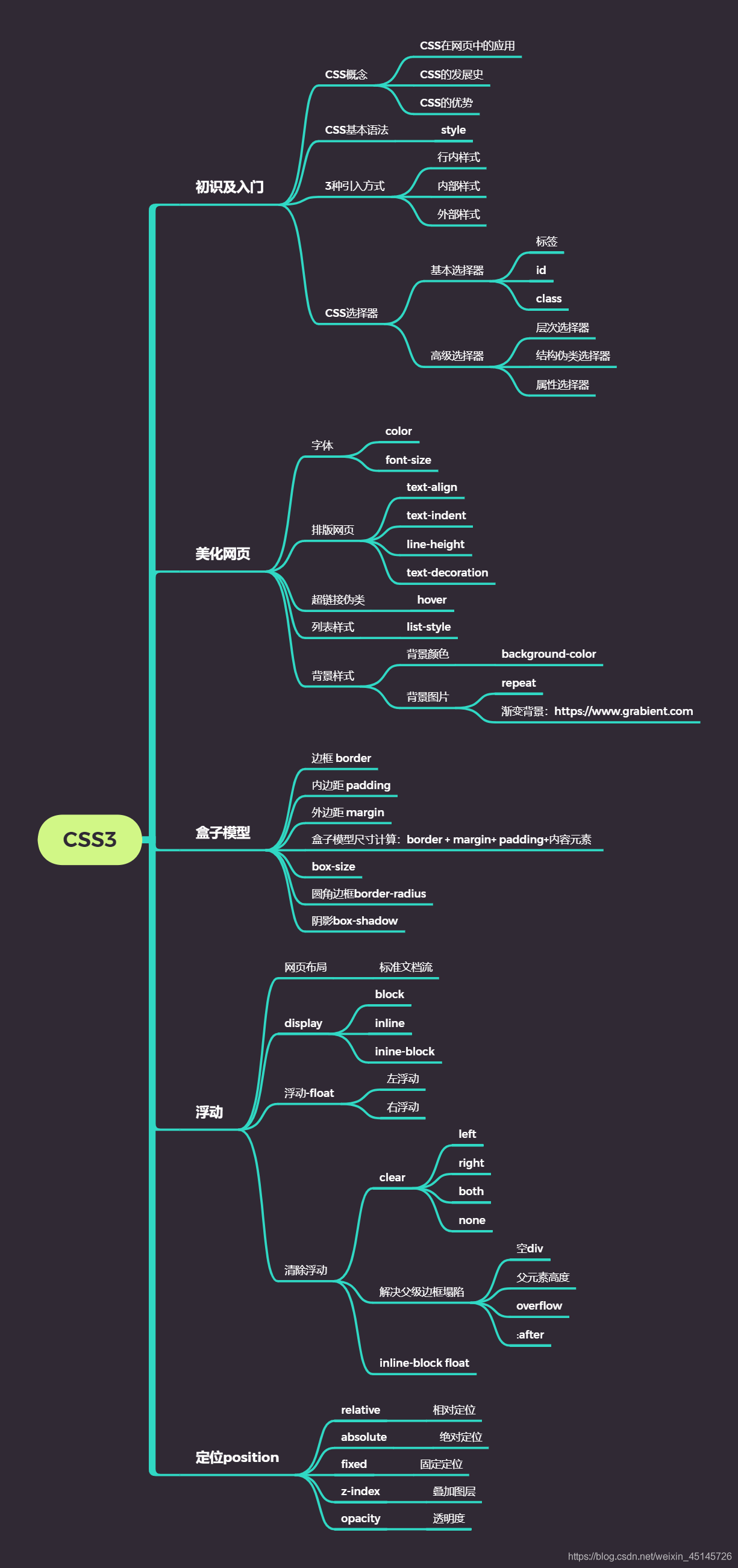
CSS
1.css是什么
2.CSS怎么用(快速入门)
3.CSS选择器(重点 + 难点)
4.美化页面(文字、阴影、超链接、列表、渐变…)
5.盒子模型
6.浮动
7.定位
8.网页动画(特效)
1.什么是CSS
1、什么是CSS
Cascading Style Sheet 层叠样式表 CSS:表现(美化网页) 字体,颜色,边距,高度,宽度,背景图片,网页定位,网页浮动
1.2、发展史
CSS1.0 CSS2.0:DIV(块)+CSS,HTML与CSS结构分离的思想,网页变得简单,SEO CSS2.1:浮动,定位 CSS3.0:圆角、阴影、动画…浏览器兼容性~
2、快速入门
 <!DOCTYPE html>
 <html lang="en">
 <head>
     <meta charset="UTF-8">
     <title>Title</title>
     <!--规范,<style>可以编写CSS的代码,每一个声明最好以“;”结尾
         语法:
             选择器{
                     声明1;
                     声明2;
                     声明3;
                 }   -->
     <style>
         h1{
             color: crimson;
         }
     </style>
 </head>
 <body>
     <h1>CSS测试</h1>
 </body>
 </html>
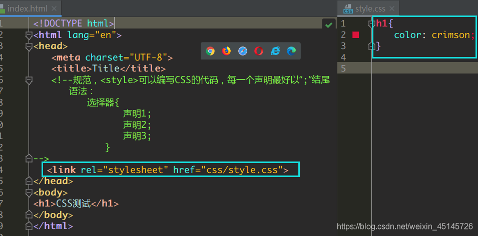
4、CSS的3种常用导入方式
<!DOCTYPE html>
<html lang="en">
<head>
    <meta charset="UTF-8">
    <title>Title</title>
    <!--规范,<style>可以编写CSS的代码,每一个声明最好以“;”结尾
        语法:
            选择器{
                    声明1;
                    声明2;
                    声明3;
                }   -->

<!--    内部样式-->
    <style>
        h1{
            color: green;
        }
    </style>

    <!--外部样式-->
    <link rel="stylesheet" href="css/style.css" />

    <!--外部导入样式导入式-->

<!--    <style>-->
<!--        @import url("http://localhost:63342/gui-study/CSS/我的第一个css程序/CSS/style.css");-->
<!--    </style>-->
</head>
<body>
<h1>CSS测试</h1>

</body>
</html>

<!--优先级:就近原则(谁离元素h1近谁优先级更高) 行内样式 > 内部样式 > 外部样式-->
<!--行内样式:在标签元素中,编写一个style属性,编写样式即可-->
导入式 @import
是CSS2.1特有的!
2.选择器(重要)
作用:选择页面上的某一个后者某一类元素
2.1、基本选择器
1、标签选择器
选择一类标签
格式: 标签 { }
 <head>
     <meta charset="UTF-8">
     <title>Title</title>
     <style>
         h1{
             color: orange;
             background: blue;
             border-radius: 10px;
         }
         h3{
             color: orange;
             background: blue;
             border-radius: 10px;
         }
         p{
             font-size: 80px;
         }
     </style>
 </head>
 <body>
 <h1>标签选择器</h1>
 <p>我爱学习</p>
 <h3>学习JAVA</h3>
 </body>
2、类选择器class
选择所有class一致的标签,跨标签
格式: .类名{}
 <head>
     <meta charset="UTF-8">
     <title>Title</title>
     <style>
         /*类选择器的格式 .class的名称{}
             好处:可以多个标签归类,是同一个class,可以复用*/
         .demo1{
             color: blue;
         }
         .demo2{
             color: red;
         }
         .demo3{
             color: aqua;
         }
     </style>
 </head>
 <body>
 <h1 class = "demo1">类选择器:demo1</h1>
 <h1 class="demo2">类选择器:demo2</h1>
 <h1 class="demo3">类选择器:demo3</h1>
 <p class="demo3">p标签</p>
 </body>
3、id 选择器
全局唯一
格式: #id名{}
 <head>
     <meta charset="UTF-8">
     <title>Title</title>
     <style>
         /*id选择器:id必须保证全局唯一
             #id名称{}
             不遵循就近原则,优先级是固定的
             id选择器 > class类选择器  >  标签选择器
         */
         #demo1{
             color: red;
         }
         .demo2{
             color: green;
         }
         #demo2{
             color: orange;
         }
         h1{
             color: blue;
         }
     </style>
 </head>
 <body>
     <h1 id="demo1" class="demo2">id选择器:demo1</h1>
     <h1 class="demo2" id = "demo2">id选择器:demo2</h1>
     <h1 class="demo2">id选择器:demo3</h1>
     <h1 >id选择器:demo4</h1>
     <h1>id选择器:demo5</h1>
 </body>
4.优先级:id > class > 标签
2.2、高级选择器
1.层次选择器
后代选择器:在某个元素的后面
后代选择器
 /*后代选择器*/
 <style>
 body p{
     background:red;
 }
 </style>
子选择器,一代
/子选择器/
 /*子选择器*/
 <style>
 body>p{
     background:orange;
 }
 </style>
相邻的兄弟选择器 同辈
/相邻兄弟选择器:只选择一个,相邻(向下)/
 /*相邻兄弟选择器:只选择一个,相邻(向下)*/
 <style>
 .active+p{
 background: red
 }
 </style>
 <body>
     <p class="active">p1<p>
     <p>p2</p>
 </body>
通用选择器
 <style>
 /*通用兄弟选择器,当前选中元素的向下的所有兄弟元素*/
     .active~p{
     background:red;
 }
 </style>
 <body>
     <p class="active">p1<p>
     <p>p2</p>
 </body>
2.4属性选择器(重要常用)
id + class结合
<head>
    <meta charset="UTF-8">
    <title>Title</title>
    <style>
        .demo a{
            float: left;
            display: block;
            height: 50px;
            width: 50px;
            border-radius: 10px;
            background: aquamarine;
            text-align: center;
            color: gray;
            text-decoration: none;
            margin-right: 5px;
            /*line-height:50px;*/
            font: bold 20px/50px Arial;
        }
        /*属性名,属性名=属性值(正则)
         = 表示绝对等于
         *= 表示包含
         ^= 表示以...开头
         $= 表示以...结尾
         存在id属性的元素
            a[]{}
         */
        a[id]{
            background: yellow;
        }
        a[id=first]{/*id=first的元素*/
            background: green;
        }

        a[class*="links"]{/*class 中有links的元素*/
            background: bisque;
        }

        a[href^=http]{/*选中href中以http开头的元素*/
            background: aquamarine;
        }
        a[href$=pdf]{/*选中href中以http开头的元素*/
            background: aquamarine;
        }
    </style>
</head>
<body>
<p class="demo">
    <a href="http:www.baidu.com" class="links item first" id="first">1</a>
    <a href="" class="links item active" target="_blank " title="test">2</a>
    <a href="images/123.html" class="links item">3</a>
    <a href="images/1.png" class="links item">4</a>
    <a href="images/1.jpg" class="links item">5</a>
    <a href="abc" class="links item">6</a>
    <a href="/a.pdf" class="links item">7</a>
    <a href="/abc.pdf" class="links item">8</a>
    <a href="abc.doc" class="links item">9</a>
    <a href="abcd.doc" class="links item last">10</a>
</p>
</body>
3.2、字体样式
-
font-family:字体
-
font-size:字体大小
-
font-weight:字体粗细
-
color:字体颜色
-
<head>
    <meta charset="UTF-8">
    <title>Title</title>
    <style>
        body{
            font-family:"Arial Black",楷体;
            color: red;
        }
        h1{
            font-size: 50px;
        }
        .p1{
            font-weight: 600;
            color: gray;
        }
    </style>
</head>
<body>
    <h1>标题</h1>
    <p>正文11111</p>
    <p class="p1">正文2222222</p>
    <p>i love study java</p>
</body>
font-weight:bolder;/*也可以填px,但不能超过900,相当于bloder*//*常用写法:*/font:oblique bloder 12px "楷体"
3.3 文本样式
1、颜色 color· rgb rgba
2、文本对齐的方式 text-align=center
3、首行缩进 text-indent:2em
4、行高 line-height: 单行文字上下居中:line-height= height
5、装饰 text-decoration
6、文本图片水平对齐: vertical-align: middle
<!DOCTYPE html>
<html lang="en">
<head>
    <meta charset="UTF-8">
    <title>Title</title>
    <!--
        颜色:
        单词
        RGB 0~F
        RGBA A: 0~1
        text-align :排版,居中。
        text-indent: 2em;段落首行缩进两个字符
        height: 300px;
        line-height: 300px;
        行高,需要和块的高度一致,就可以上下居中
    -->

    <style>
        h1{
            color: rgba(0,255,255,0.9);
            text-align: center;
        }
        .p1{
            text-indent: 2em;
        }
        .p3{
            background: #2700ff ;
            height: 300px;
            line-height: 300px;
        }
        /*下划线*/
        .l1 {
            text-decoration: underline;
        }
        /*中划线*/
        .l2{
            text-decoration: line-through;
        }
        /*上划线*/
        .l3 {
            text-decoration: overline;
        }
        /*a标签(超链接)去下划线*/
        a{
            text-decoration: none ;
        }


    </style>

</head>
<body>
<a href="">123</a>
<p class="l1">123456789</p>
<p class="l2">123456789</p>
<p class="l3">123456789</p>

<h1>故事介绍</h1>

<p class="p1">
    平静安详的元泱境界,每隔333年,总会有一个神秘而恐怖的异常生物重生,它就是魁拔!魁拔的每一次出现,都会给元泱境界带来巨大的灾难!即便是天界的神族,也在劫难逃。在天地两界各种力量的全力打击下,魁拔一次次被消灭,但又总是按333年的周期重新出现。魁拔纪元1664年,天神经过精确测算后,在魁拔苏醒前一刻对其进行毁灭性打击。但谁都没有想到,由于一个差错导致新一代魁拔成功地逃脱了致命一击。很快,天界魁拔司和地界神圣联盟均探测到了魁拔依然生还的迹象。因此,找到魁拔,彻底消灭魁拔,再一次成了各地热血勇士的终极目标。
</p>

<p class="p3">
    在偏远的兽国窝窝乡,蛮大人和蛮吉每天为取得象征成功和光荣的妖侠纹耀而刻苦修炼,却把他们生活的村庄搅得鸡犬不宁。村民们绞尽脑汁把他们赶走。一天,消灭魁拔的征兵令突然传到窝窝乡,村长趁机怂恿蛮大人和蛮吉从军参战。然而,在这个一切都凭纹耀说话的世界,仅凭蛮大人现有的一块冒牌纹耀,不要说参军,就连住店的资格都没有。受尽歧视的蛮吉和蛮大人决定,混上那艘即将启程去消灭魁拔的巨型战舰,直接挑战魁拔,用热血换取至高的荣誉。
</p>

</body>
</html>
3.4、文本和超链接伪类
a:hover用的多(常用)
<!DOCTYPE html>
<html lang="en">
<head>
    <meta charset="UTF-8">
    <title>Title</title>

    <style>
        /*默认颜色*/
        a{
            text-decoration: none;
            color: #000000;
        }
        /*鼠标悬浮的状态(重点)*/
        a:hover{
            color: coral;
            font-size: 24px;
        }
        /*鼠标按住未释放的状态*/
        a:active {
            color: green;
        }
        /*text-shadow:阴影颜色,水平偏移,垂直偏移,阴影半径*/
        #price{
            text-shadow: #3cc7f5 10px 0px 2px;
        }
    </style>

</head>

<body>
<a href="#">
    <img src="images/a.png" alt="">
</a>
<p>
    <a href="#">决战和之国</a>
</p>
<p>
    <a href="">作者:尾田老师</a>
</p>
<p id="price">
    ¥99
</p>
</body>
</html>
3.5阴影:
/* 第一个参数:表示水平偏移第二个参数:表示垂直偏移第三个参数:表示模糊半径第四个参数:表示颜色*/
text-shadow:5px 5px 5px 颜色
3.6 列表
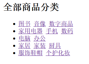
简单网页:
<!DOCTYPE html>
<html lang="en">
<head>
    <meta charset="UTF-8">
    <title>Title</title>
    <link href="css/style.css" rel="stylesheet" type="text/css"><!--rel表示为外部引用-->
</head>
<body>
<div id="nav">
    <h2 class="title">全部商品分类</h2>
    <ul>
        <li>
            <a href="#">图书</a>
            <a href="#">音像</a>
            <a href="#">数字商品</a>
        </li>
        <li>
            <a href="#">家用电器</a>
            <a href="#">手机</a>
            <a href="#">数码</a>
        </li>
        <li>
            <a href="#">电脑</a>
            <a href="#">办公</a>
        </li>
        <li>
            <a href="#">家居</a>
            <a href="#">家装</a>
            <a href="#">厨具</a>
        </li>
        <li>
            <a href="#">服饰鞋帽</a>
            <a href="#">个性化妆</a>
        </li>
        <li>
            <a href="#">礼品箱包</a>
            <a href="#">钟表</a>
            <a href="#">珠宝</a>
        </li>
        <li>
            <a href="#">食品饮料</a>
            <a href="#">保健食品</a>
        </li>
        <li>
            <a href="#">彩票</a>
            <a href="#">旅行</a>
            <a href="#">充值</a>
            <a href="#">票务</a>
        </li>
    </ul>
</div>
</body>
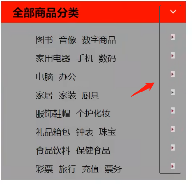
效果如下,特别丑:
在 head 标签中引入 css 文件
<link href="css/style.css" rel="stylesheet" type="text/css">
style.css
#nav{
    width: 300px;
    background: antiquewhite;
}
.title{
    font-size: 18px;
    font-weight: bold;
    text-indent: 1em;/*缩进*/
    line-height: 35px;
    background: red url("../images/下箭头.png") 250px -1px no-repeat;
}
/*ul li*/
/*
list-style:
    non 去掉实心圆
    circle 空心圆
    square 正方形
*/
/*ul{!*nav替换效果*!*/
/*    background: antiquewhite;*/
/*}*/
ul li{
    height: 30px;
    list-style: none;
    text-indent: 1em;
    background-image:url("../images/右箭头.png");/*默认是全部平铺的*/
    /*background-repeat:repeat-x;!*水平平铺*!*/
    /*background-repeat:repeat-y;!*垂直平铺*!*/
    background-repeat:no-repeat;/*不平铺*/
    background-position: 220px 2px;
}
a{
    text-decoration: none;
    font-size: 14px;
    color: black;
}
a:hover{
    color: burlywood;
    text-decoration: underline;/*把鼠标放上数字有下划线*/
}
3.7 背景
背景颜色
背景图片
<!DOCTYPE html>
<html lang="en">
<head>
    <meta charset="UTF-8">
    <title>Title</title>

    <style>
        div { /*设置div的基础设置*/
            width: 1920px;
            height: 1080px;
            border: 1px solid red;
            background-image: url("images/暖阳2.png");
            /*默认是全部平铺的*/
        }
        . div1{
            background-repeat: repeat-x;
        }
        . div2 {
            background-repeat: repeat-y;
        }
        . div3{
            background-repeat: round;
        }
    </style>

</head>

<body>
    <div class="div1"></div>
    <div class="div2"></div>
    <div class="div3"></div>
</body>
</html>
作业:加上这些小图标
3.8 渐变
网站:Grabient(Grabient)
background-color: #0093E9;
background-image: linear-gradient(45deg, #0093E9 0%, #80D0C7 100%);
4. 盒子模型
4.1 什么是盒子模型
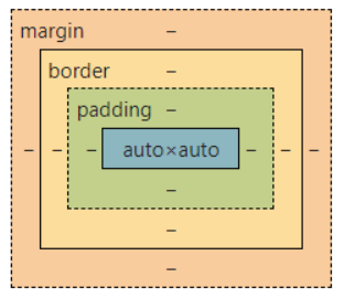
margin: 外边距
padding: 内边距
border: 边框
4.2 边框
border:粗细 样式 颜色
1.边框的粗细
2.边框的样式
3.边框的颜色
简单网页:
<!DOCTYPE html>
<html lang="en">
<head>
    <meta charset="UTF-8">
    <title>Title</title>
    <style>
        /*body:总有一个默认的外边距margin: 0; ,常见操作*/
        /*h1,ul,li,a,body {*/
        /*    margin: 0;*/
        /*    padding: 0;*/
        /*    text-decoration: none;*/
        /*}*/
        /*border:粗细,样式,颜色*/
        #box{
            width: 300px;
            border: 1px solid red;
        }

        h1{
            font-size: 24px;
            background-color: #3cbda6;
            line-height: 30px;
        }

        form{
            background: #3cbda6 ;
        }
        div:nth-of-type(1) input{
            border: 3px solid black;
        }
        div:nth-of-type(2) input{
            border: 3px dashed #4d0b8c ;
        }
        div:nth-of-type(3) input{
            border: 2px dashed #008c27;
        }

    </style>
</head>
<body>
<div id="nav">
    <h1>会员登录</h1>
    <form action="#">
        <div id="user">
            <span>用户名:</span>
            <input type="text">
        </div>
        <div>
            <span>密码:</span>
            <input type="text">
        </div>
        <div>
            <span>邮箱:</span>
            <input type="text">
        </div>
    </form>
</div>
</body>
</html>
4.3 外边距
<!DOCTYPE html>
<html lang="en">
<head>
    <meta charset="UTF-8">
    <title>Title</title>
    <!--外边距的妙用:居中元素   margin: 0 auto; -->
    <style>
        #nav{
            width: 300px;
            border: 1px solid red;
            margin: 0 auto;
        }
        /*
        顺时针旋转:
        margin:0
        margin:0 1px
        margin:0 1px 2px 3px
        */

        h2{
            font-size: 24px;
            background-color: #3cbda6;
            line-height: 30px;
            margin: 0;
        }

        form{
            background: #3cbda6 ;
        }
        /*用户名的内边距*/
        /*div:nth-of-type(1){*/
        /*    padding: 10px 2px;*/
        /*}*/

    </style>
</head>
<body>
<div id="nav">
    <h1>会员登录</h1>
    <form action="#">
        <div id="user">
            <span>用户名:</span>
            <input type="text">
        </div>
        <div>
            <span>密码:</span>
            <input type="text">
        </div>
        <div>
            <span>邮箱:</span>
            <input type="text">
        </div>
    </form>
</div>
</body>
</html>
盒子的计算方式:你这个元素到底多大?
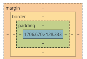
margin + border + padding +内容宽度
4.4、圆角边框----border-radius
border-radius有四个参数(顺时针),左上->右上->右下->左下
圆圈:圆角=半径
<!DOCTYPE html>
<html lang="en">
<head>
    <meta charset="UTF-8">
    <title>Title</title>
    <style>
        div{
            width: 100px;
            height: 100px;
            border: 10px solid red;
            /*一个border-radius只管一个圆的1/4*/
            border-radius: 50px 20px 20px 30px;/*左上 右上 右下 左下 ,顺时针方向*/
        }
</style>
</head>
<body>

<div></div>

</body>
</html>
4.5 盒子阴影
<!DOCTYPE html>
<html lang="en">
<head>
    <meta charset="UTF-8">
    <title>Title</title>

    <style>
        img{
            border-radius: 58px;
            box-shadow: 10px 10px 108px yellow;
        }
    </style>
</head>
<body>
<div style="width: 500px ;display: block;text-align: center">
    <img src=" ../images/头像.jpg" alt="">
</div>
</body>
</html>
5. 浮动
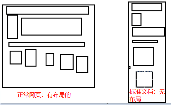
5.1 标准文档流
-
块级元素 块级元素(block element)在浏览器中占据整行,并排斥其它元素与其位于同一行。 也就是说,块级元素的宽度是 100%。 常见的块级元素如下表: 2. 行内元素 行内元素又称内联元素(inline block)。 在浏览器中可以与其它行内元素共占一行,只有当多个元素的总宽度大于浏览器的宽度时,才会换行显示。
-
块级元素:独占一行 h1~h6 、p、div、 列表…
-
行内元素:不独占一行 span、a、img、strong
注: 行内元素可以包含在块级元素中,反之则不可以。
5.2 display(重要)
切换块级元素和行内元素,让他们排在一列
<!DOCTYPE html>
<html lang="en">
<head>
    <meta charset="UTF-8">
    <title>Title</title>

    <!--
        block块元素
        inline行内元素
        inline-block:是块元素,但是可以内联,在一行!
    -->
    <style>
        div{
            width: 100px;
            height: 100px;
            border: 1px solid red;
            display: inline-block;
        }

        span{
            width: 100px;
            height: 100px;
            border: 1px solid red;
            display: inline-block;
        }
    </style>

</head>
<body>
<div>div块元素</div>
<span>span行内元素</span>
</body>
</html>
这个也是一种实现行内元素排列的方式,但是我们很多情况都是用 float
5.3 浮动 float
1、左右浮动 float
div {
    margin: 10px;
    padding: 5px;
}
#father {
    border:1px #000 solid;
}
. layer01 {
    border:1px #F00 dashed;
    display: inline -block;
    float: right;
}
. layer02 {
    border:1px #00F dashed;
    display: inline -block;
    float: right;
}
. layer03 {
    border:1px #060 dashed;
    display: inline- block;
    float: right;
}
. layer04 {
    border:1px #666 dashed;
    font-size:12px;
    line-height:23px;
    display: inline -block;
    float: right;
}
5.4 父级边框塌陷问题(就是用边框把图片包裹起来)
clear
/*
clear: right; 右侧不允许有浮动元素
clear: Left; 左侧不允许有浮动元素
cLear: both; 两侧不允许有浮动元素
clear: none;
*/
解决方案:
1、增加父级元素的高度~
#father {
    border:1px #000 solid;
    height: 800px;
}
2、增加一个空的 div 标签,清除浮动
<div class="clear"></div>

.clear{
    clear: both;
    margin: 0;
    padding: 0;
}
3、overflow
在父级元素中增加一个overflow:hidden;
overflow: scroll;
4、父类添加一个伪类:after(建议使用)
#father:after{
    content :'';/*建议这样做,相当于在父级一个空的div文本*/
    display: block;/*变成一个块,现在这个空div有高度和宽度*/
    clear: both;/*清除浮动*/
}
小结:
- 浮动元素后面增加空div
简单,代码中尽量避免空div - 设置父元素的高度
简单,元素假设有了固定的高度,就会被限制 - overflow
简单,下拉的一些场景避免使用 - 父类添加一个伪类: after (推荐)
写法稍微复杂一点, 但是没有副作用,推荐使用!
5.5 对比
- display
方向不可以控制 - float
浮动起来的话会脱离标准文档流,所以要解决父级边框塌陷的问题~
6. 定位
6.1 相对定位
<!DOCTYPE html>
<html lang="en">
<head>
    <meta charset="UTF-8">
    <title>Title</title>

    <style>
        body {
            padding: 28px;
        }
        div{
            margin: 10px;
            padding: 5px;
            font-size: 12px;
            line-height: 25px;
        }
        #father{
            border: 1px solid #666;
            padding: 0;
        }
        #first{
            background-color: #a13d30;
            border: 1px dashed #b27530;
            position: relative; /*相对定位*/
            tpp: - 20px;
            left: 28px;
        }
        #second{
            background-color: #255099;
            border: 1px dashed #255066;
        }
        #third{
            background-color: #1c6699 ;
            border: 1px dashed #1c6615;
            position: relative;
            bottom: -10px;
            right: 20px;

        }
    </style>
</head>
<body>
<div id="father">
    <div id="first">第一个盒子</div>
    <div id="second">第二个盒子</div>
    <div id="third">第三个盒子</div>
</div>

</body>
</html>
相对定位: position: relative;
相对于原来的位置,进行指定的偏移,相对定位的话,它仍然在标准文档流中,原来的位置会被保留
top: -20px;
left: 20px;
bottom: - 10px;
right: 20px;
练习题:链接卡
<!DOCTYPE html>
<html lang="en">
<head>
    <meta charset="UTF-8">
    <title>Title</title>

    <style>
        #box{
            width: 300px;
            height: 300px;
            padding: 10px;
            border: 2px solid red ;
        }
        a{
            width: 100px;
            height: 100px;
            text-decoration: none;
            background: #ffa1f2;
            line-height: 100px;
            text-align: center;
            color: white;
            display: block;
        }
        a:hover{
            background: #47a4ff;
        }
        .a2,.a4{
            position: relative;
            left: 200px;
            top: -100px;
        }
        .a5{
            position: relative;
            left: 100px;
            top: -300px;
        }
    </style>

</head>
<body>
    <div id="box">
        <a class="a1" href="#">链接1</a>
        <a class="a2" href="#">链接2</a>
        <a class="a3" href="#">链接3</a>
        <a class="a4" href="#">链接4</a>
        <a class="a5" href="#">链接5</a>
    </div>

</body>
</html>
6.2 绝对定位
定位:基于xxx定位,上下左右~
1、没有父级元素定位的前提下,相对于浏览器定位
2、假设父级元素存在定位,我们通常会相对于父级元素进行偏移~
3、在父级元素范围内移动
相对于父级或浏览器的位置,进行指定的偏移,绝对定位的话,它不在在标准文档流中,原来的位置不会被保留
<style>
    div{
        margin: 10px;
        padding: 5px;
        font-size: 12px;
        line-height: 25px;
    }
    #father{
        border: 1px solid #666;
        padding: 0;
        position: relative;
    }
    #first{
        background-color: #a13d30;
        border: 1px dashed #b27530;
        }
    #second{
        background-color: #255099;
        border: 1px dashed #255066;
        position: absolute;
        left: 100px;
    }
    #third{
        background- color: #1C6699;
        border: 1px dashed #1c6615;
    }
</style>
6.3 固定定位 fixed
<!DOCTYPE html>
<html lang="en">
<head>
    <meta charset="UTF-8">
    <title>Title</title>

    <style>
        body {
            height: 1000px;
        }
        div:nth-of-type(1) { /*绝对定位:相对于浏览器*/
            width: 100px;
            height: 100px;
            background: red;
            position: absolute;
            right: 0;
            bottom: 0;
        }
        div:nth-of-type(2){ /*fixed, 固定定位*/
            width: 50px;
            height: 50px;
            background: yellow;
            position: fixed;
            right: 0;
            bottom: 0;
        }
    </style>
</head>
<body>
<div>div1</div>
<div>div2</div>
</body>
</html>
6.4 z-index
这叫图层
z-index:默认是0, 最高无限~ 999
html:
<!DOCTYPE html>
<html lang="en">
<head>
    <meta charset="UTF-8">
    <title>Title</title>
    <link rel="stylesheet" href="css/style.css">
</head>
<body>
<div>
    <ul>
        <li><img src="images/bg.jpg" alt=""> </li>
        <li class="tipText">登录月球计划</li>
        <li class="tipBg"></li>
        <li>时间: 2099-01-01</li>
        <li>地点:月球一号基地</li>
    </ul>
</div>
</body>
</html>
css:
#content{
    width: 380px;
    padding: 0px;
    margin: 0px;
    overflow: hidden;
    font-size: 12px;
    line-height: 25px;
    border: 1px #000 solid;
}
ul, li{
    padding: 0px;
    margin: 0px;
    list-style: none;
}
/*.父级元素相对定位*/
#content ul{
    position: relative;
}
.tipText,.tipBg{
    position: absolute;
    width: 331px;
    height: 21px;
    top: 173px;
}
.tipText{
    color: red;
    /*z-index: e;*/
}
.tipBg {
    background: #000;
    opacity: 0.5; /*背景透明度*/
    filter:Alpha(opacity=50);/*以前的版本使用*/
}
7、动画及视野拓展
css做动画过于繁琐,已有很多工具间接性做出
百度搜索canvas动画、卡巴斯基监控站(仅作了解)
8、总结